
- Frequently Asked Questions

- All About Features
- How to Install the Tracking Code
- User Guides
- Integrating With Other Platforms
- Legal, Data Privacy & Certificates
- White Label Analytics
- Glossary
- Affiliate Program
- Contact
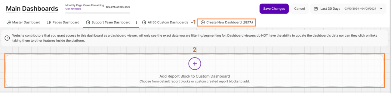
Main Dashboards
All You Need to Know at a Glance
One Glance to See It All

You can use different dashboards to quickly gather essential information about your website's performance in one place. These dashboards allow you to apply filters and visitor segments to focus on specific data.
You also now have the ability to create your own custom dashboards and add report blocks tailored to your needs, providing a more customized and insightful view of your website's performance.
The Main Dashboards is separated into 3 sections. In this module, we’ll learn more about these sections and their associated report blocks:
- Master Dashboard (formerly "Overview") : This section provides a quick overview of all the most important data from your website.
- Pages Dashboard: This section provides you with a thorough overview of your website’s pages and corresponding stats within the selected time period.
- Create New Dashboard: This provides you with the option to create custom dashboards to precisely match your preferences and needs.
Set the Time
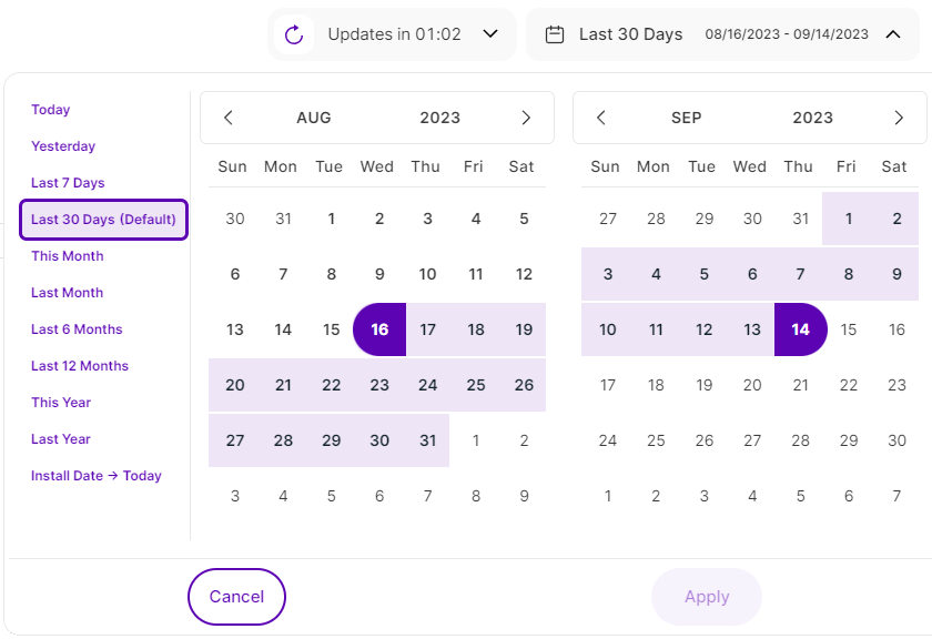
Right above the tiles, you can see a date-selector icon. This enables you to select a certain time period, or specific day, for which you want the dashboard's data to correspond.
It is crucial to limit the presentation of data to specific dates or timeframes during which you executed potential campaigns or implemented other strategies. This will allow you to assess the effectiveness of these actions and use the insights gained for future planning.
You also have the possibility to set the dashboard's data to auto-reload every few seconds, minutes or hours depending on your needs.
Important Note: The app now remembers previously set segments, filters, filter templates, and date intervals, even when you navigate away from the page, log out, or log back in. When your session expires or you close the tab, it automatically switches back to the default setting of "Last 30 Days."
Some General Hints

- Click on the feature counter (Monthly Page Views Remaining section) to display its tooltip showing the limits of your current plan. Click the Increase your limits button to access the “Upgrade Plan” option.
- At the bottom of each tile, there is an option to "View All" (specific wording will depend on the tile you are viewing). For the example shown in the image above, it is "View All Countries & Cities". Selecting this button redirects you to a specific module with greater detail breakdown. Why not give it a try?
- Almost all tiles contain additional information if you hover over them. Just let your cursor run over various elements and discover how much data is packed into a tile.
- We've made accessing tooltips easier and less cluttered within the app. Here's how it works:
- Page header titles, RB titles, and Section headers: These tooltips now appear only when you click on the element itself.
- Tabs: The tooltip will be available by clicking only if the tab is currently active.
Hint: Look for a dashed underline on clickable elements to identify those with tooltips.
Some tiles have a small "Ø icon", giving you yet more information about what it represents. Simply hover over the icon to reveal the details in a quick and convenient way.
Dashboard Feature Tour

Our powerful new dashboard feature empowers you to visualize, analyze, and understand your information like never before. This guided tour will equip you with the knowledge to leverage the dashboard's full potential and transform your data into actionable insights.
This dashboard feature tour provides a clear roadmap, guiding you through all the essential sections of our app - modules, submodules, settings, and main buttons.
Ready to explore? The dashboard tour is always at your fingertips! Tap the "Start Tour!" or "Feature Tour Completed!" button in the top right corner of the Main Dashboard to get started.
Filters for Enhanced Dashboard Control

In the dynamic landscape of website analytics, having the ability to dissect and understand your data is paramount. To empower you with greater control and deeper insights, we're thrilled to announce the introduction of an array of new filters on our Main Dashboards report blocks. Let's dive into the exciting new features that will supercharge your analytics experience:
- Browser Name: Allows you to filter the data by browser name which helps you optimize your website based on your audience preferences.
- Browser Version: Same with the Browser Name, you can ensure that your website is optimized for the browsers your audience prefers. Identify issues related to specific browser versions and prioritize fixes accordingly.
- City of Visit: Drill down into user location data even further by using this filter. This information can be pivotal for local businesses, helping them tailor their content and marketing strategies to specific cities.
- Company Category Associated With Visit: B2B businesses can derive significant value from this filter. Identify which companies are visiting your site and segment them by industry category. This can inform lead generation strategies and personalized outreach efforts.
- Company Name Associated Country Name: Same with the Company Category, this filter would help in analyzing the data by industry category, getting to know which companies from specific industries visit your website the most. This filter allows you to segment and organize your visitor data to gain insights into the types of companies and industries showing interest in your website.
- Country Name: Businesses with a global presence will appreciate the Country Name filter. It enables you to explore user behavior and preferences on a country-specific level, aiding in localization efforts and targeting strategies.
- Device Type: Understand how your audience accesses your website by filtering data based on device type. This filter helps ensure that your site is responsive and user-friendly across various devices, from desktops to smartphones.
- IP: The IP filter can be a valuable tool for tracking visits from specific IP addresses, such as those from your organization or potential clients. Monitor user activity and tailor your website experience accordingly.
- Operating System: Ensure optimal performance across different operating systems by filtering data by OS. This information can be used to identify compatibility issues and fine-tune your website for various platforms.
- Page URL: Dive deep into your website's performance by narrowing down data to specific page URLs. This filter is invaluable for identifying which pages are driving the most engagement, conversion, or perhaps need optimization.
- Screen Resolution: This filter is essential for optimizing your website's layout and design. Make sure your site looks stunning on all screen sizes and resolutions by analyzing data through this filter.
- Traffic Channel: Understanding where your website traffic is coming from is vital. The Traffic Channel filter lets you segment your data by channels like organic search, paid search, direct, referral, and more. This insight can help you allocate resources more effectively and refine your marketing strategies.
- UTM Campaign Filter: UTM parameters play a crucial role in tracking the performance of your marketing campaigns. Now, you can easily filter your dashboard data by specific UTM campaigns to see exactly how each campaign is performing.
These filters are your ticket to a more insightful and optimized digital strategy. By understanding your data at a granular level, you can make informed decisions and stay competitive in the digital world. Keep an eye out for even more exciting features as we continue to enhance our analytics platform. Get ready to supercharge your insights with our new Dashboard filters.
Data Visualization Options

Our user-friendly dashboards act as specialized interfaces, seamlessly presenting crucial website intelligence insights from our comprehensive analytics platform. This empowers businesses to access consolidated, real-time reports essential for swift and informed decision-making.
Uncover insights that resonate with you! We offer a variety of customizable visualization options for the main visits report block, allowing you to choose the format that best suits your needs.
Explore the following visualization options available for the main visits report block:
- Line Diagram View
- Line Diagram
- Line Chart Stacked
- Stepped Line Chart
- Table View
- Bar Chart
- Radar Chart Stacked View
Line Diagram View
Line diagrams serve as the backbone of data visualization, adept at illustrating trends and patterns over time. Picture a series of data points resembling stepping stones across a river; a line chart connects these points, forming a visual bridge that unveils the trajectory of your data journey.
Continue reading to learn more about the different line diagram views and line styling options.
Important Hint: To have a better perspective on the data provided in the chart, simply click on each KPI above the graph to choose or deselect it. Enable only those that interest you, or keep them all enabled for a more comprehensive look.
Line Diagram

Line diagrams, commonly known as line charts, excel at presenting trends by connecting data points with a line. This data representation makes it easy to observe or analyze how a certain KPI evolves over time, making it ideal for tracking website traffic, sales growth, or any other metric with a narrative.
Want to tailor the way your data is visualized? Click the three-dot icon next to each KPI to unlock the following line styling options:
- Unfilled Line Styling
- Filled Line Styling
- Dashed Line Styling
By experimenting with these options, you can customize your data visualization to best suit your needs and effectively communicate your findings.
Line Chart Stacked

A stacked line chart has lines that do not intersect since they are cumulative at each position. In a stacked 100% line chart, the lines reach a total of 100% of the axis range at each point.
Stepped Line Chart

Stepped line charts are a type of line chart that connects data points using horizontal and vertical steps to demonstrate discrete changes over time. This format is appropriate for data acquired on a regular basis, such as daily sales figures.
Table View

Need to examine specific values or compare data points side-by-side? The table view offers a different perspective on your data, transitioning from a visual representation to a detailed breakdown. It presents your information in a clear, tabular format, with each data point occupying its own cell.
The table is divided into the following columns:
- Date
- Overall Page Views
- Overall Sessions
- New Visitors
- Returning Visitors
- Converting Visitors
Bar Chart

Moving on to another data visualization powerhouse, let's explore bar charts! This type of chart excels at demonstrating how different KPIs compare to one another. Each KPI is represented by a rectangular bar whose height is directly proportionate to the relevant value.
This makes bar charts helpful for determining which category has the highest or lowest value.
Radar Chart Stacked View

We're excited to introduce the latest addition to your data visualization toolbox - the radar chart stacked view! Radar charts are a great tool for displaying performance information. You can easily determine which KPIs are strong points and those that may need some enhancement by comparing variables on the same chart. They are thus effective tools for evaluating performance and making strategic decisions.
Each variable has a central axis. All axes are aligned radially, with equal distances between them, while the scale remains constant. Grid lines that connect axis to axis are commonly used as guides. Each variable value is shown on a separate axis, and all variables in a dataset are joined to form a polygon.
Download Your Data

We are excited to announce a new feature—users can now seamlessly download the data showcased in the main visits report block (Visits, Sessions & Visitors) in the Master Dashboard!
This addition provides unparalleled flexibility in handling information and caters to diverse user preferences by offering four export options:
- .CSV (Comma-Separated Values): Ideal for easy integration with spreadsheet software.
- .PDF (Portable Document Format): Ensures a standardized and easily shareable document.
- .PNG (Portable Network Graphics): Perfect for high-quality image representation of the data.
- .XLSX (Microsoft Excel Workbook): Facilitates detailed analysis and manipulation within Excel.
You can find the download icon next to the compare button on the right side of this report block. Clicking this icon will open the drop-down list. Simply tap the download button and select your preferrred file format to download.
Important Notes:
When exporting data in CSV and XLSX formats, you will notice a 'Data Segment' column. This column is derived from the 'compare' option. In this context, Data Segment 2 consistently represents the 'current one'—the dataset selected by the user in the main date picker. On the other hand, Data Segment 1 corresponds to the data from the comparison mode, capturing the previous period or year-on-year data. This distinction provides valuable context when analyzing and comparing datasets within the exported files.
Master Dashboard
As you begin to explore, you will now notice a vast wealth of information available for each section on the Master Dashboard. Check out the following segments, which will delve into the details of each tile.
Quick Note: Don't forget to read the general hints about the dashboard tiles!
Page Views, Sessions & Visitors

This tile is also called the Main Visits Report Block. Within this module, you are being presented an overview of the most useful KPIs about your website's traffic, on a selectable timescale. Get to know more about the following KPIs:
- Overall Page Views: The overall number of page views registered on your website pages during the selected time period. Every time a visitor reloads a page or visits a new page on your website, this counts as a view/visit. A visitor can generate multiple page views during a session - this is why the number of page views is usually higher than the number of visitors. This is one of the most important metrics to track, as it can define the popularity of a website,and the cost of paid partnerships and ads and it can also be proof of growth and trust within the market.
- Overall Visitor Sessions: A session represents a set of interactions that a single visitor undertakes on a webpage viewssite during a particular period of time (we define the length of a session as 3 hours). A session can include visited pages, triggered events, or e-commerce transactions made by a visitor within a specific time range. Sessions do not differentiate between new and returning visitors
- Total Visitors: It is the sum of the new and returning visitors within the selected time range.
- New Visitors: The number of unique visitors who have visited your website in the selected time range for the first time. A visitor can only be counted once as being new.
- Returning Visitors: The number of visitors that return to your site, after having already been tracked at least once previously visiting your website (during a session prior to the currently selected time range). If a visitor visits your website twice in the selected time range, they will be counted once as a new visitor and once as a returning visitor.
- Converting Visitors: The number of visitors that have reached at least one of your website's defined conversion pages during their session on your site.
At the top right of this report block, you’ll find the Compare radio button that enables the following data comparison options:
- Compare Previous Period: Compares the current data to the previous period (if it exists).
- Compare Year over Year: Compares the current data to the same period of the previous year(if it exists).
You can now compare your current data to the previous period or compare it year over year. You’ll also find the dates covered by the previous period or year, for example, 08/02/2023 - 09/01/2023. This enables you to get a better view of your current data compared to the previous equivalent period or year. The lines in lighter shades represent the data from the previous time period.
Important Hints:
- Make sure the desired time period is selected, so that the data matches what you want to see. The default is Last 30 Days.
- Note: The system retains the last filter/date interval selected, even after logout and a new login.
- Next to the Compare radio button, you'll find the improved apply filtering option, giving you even more control over your data analysis.
What's New? We've revamped the filtering by Page URL option to unlock a powerful new feature and let you analyze a variety of URLs at the same time. - For a better perspective on the data displayed in the chart, you can select or deselect certain KPIs simply by clicking on each of them above the graph. Enable just the ones that you are interested in or maintain them all to get a more complete overview.
- Each metric also has a percentage beneath it, which represents a comparison with the previous equivalent period. They can be:
Green ( You’re on track! ): The data presented has improved in comparison to the previous period.
Red ( You have work to do! ): The data presented has worsened in comparison to the previous period.
This color scheme allows you to see whether your website is on a good track or not – if all or most of your KPIs are green, things are working out as they should. If all or most of them are red, you should take action. - Just below the KPIs, you are given the option to group the data by Day, Week, Month, or Year intervals. Report blocks with weekly, monthly, and yearly data now clearly display both start and end dates for each period to improve readability. This lets you quickly grasp the timeframe for each data point.
- By default, the data is displayed using line charts with each KPIs represented by a line. We now offer a variety of customizable data visualization options that you can choose from based on your preference. To get more detailed information, hover your cursor over each data point.
Filtering by Page URL

Our powerful new filtering system lets you ditch the back-and-forth and analyze multiple web pages side-by-side for effortless performance comparisons.
Here's what you can do:
- Effortless Comparison: Analyze a variety of URLs at the same time. Simply enter full URLs or use partial matches for flexibility.
- Side-by-Side Insights: Gain a clear picture of how different pages perform by analyzing their data next to each other. This holistic view empowers you to identify trends and optimize your website strategy effectively.
- Currently Available: This feature is currently available on the Main Visits Report Block (Page Views, Sessions & Visitors) and the Pages Dashboard. We're actively working to expand it to other report blocks soon!
Page Views Overall on the Top 6 Pages

This tile displays the six most popular pages within your website and the amount of page views that were tracked during the selected time period (including reloads). This overview enables you to see which content is the most interesting to your user base. Take your learnings and focus on what your visitors are looking for!
Every row represents a popular page on your website and its relevant information.
- The title and URL of the page
- The number of page views recorded for that page
- A donut chart indicating how much of your overall website's traffic was received by this page within the selected time period
Enhance your control and gain deeper insights using our new filtering options for this report block. You can now find the Apply Filtering icon on the top right of this tile. This allows you to refine data for more precise analysis. Customize filters using one or multiple criteria, and save them as templates for future use. You can read more about the filters here.
Important Notes:
- The sum of all the percentages shown in this report block does not have to be 100% because other pages may have been visited but are not included in this top six list.
- To view all the pages that have been visited, simply click on the Show All Page Views button located at the bottom of the tile. This will take you to a complete list of your website's pages, along with the corresponding view counts for each page.
- Everything about the corresponding functionality of this module and more can be found here.
Bounce Rate

This report block displays your website's bounce rate as a percentage within a specified time frame.
The Bounce Rate represents the proportion of website visitors who navigate away from the website after viewing only one page, regardless of how long they stayed or the method of their departure.
The data can be grouped by days, weeks, months, or years within this graph. Moving your cursor over the line will show you more important information, including a comparison of the selected data to the previous period.
Gain greater control and deeper insights with our new filtering options for this report block.You can now find the Apply Filtering icon on the top right of this tile. This allows you to refine data for more precise analysis. Customize filters using one or multiple criteria, and save them as templates for future use. You can read more about the filters here.
Important Notes:
- An increasing bounce rate indicates that visitors aren't engaged by your content or the products/services you provide. Conversely, declining bounce rates suggest that visitors are interested in what they find on the initial page and are exploring further within your website.
- Note that if a visitor reloads that one single page they initially visit, it will be considered a multi-page visit, and will not be counted as a bounce.
- This is the only exception where a decrease in percentage is a good sign, hence the green color. In all other cases, negative percentages in comparison mode will appear red.
- This metric might not be very accurate for one-page websites.
Top Visiting Countries

Web analytics tools can categorize and present website visitors based on various factors, including their location. The geographical location of visitors is vital for delivering content and services that are relevant to their specific needs.
This tile will show you the top six countries from where your website's visitors originate.
Every row shows one country your visitors were located when visiting your website, reflecting the following information.
- The flag and name of the country.
- The number of sessions tracked from each country
- A donut chart indicating how much of your overall website's traffic was received from each country within the selected time period
Important Notes:
- The sum of all the percentages shown in this tile does not have to be 100% because there might be other countries that your visitors are located in but are not included in this top six list.
- To view all the countries your visitors are coming from, simply click on the "View All Countries & Cities" button located at the bottom of the tile. This will lead you to a complete list of your visitor's origins (even city-based), along with the corresponding percentage and total number of visitors based on the selected time period.
- Everything about the corresponding functionality of this module and much more can be found here.
Live Visitors

This tile shows the number of visitors that accessed your website within the last five minutes or the ones that are currently visiting it in real time.
On this map, you will see flag pins if you have visitors currently on your website.
If you hover over each round flag pin, you will receive more information about the visitor(s) that are currently navigating your website, such as the flag, the country, and the number of live visitors. Once you click it, you'll see a tooltip with the following information:
- Status: Shows the visitor's status such as New, Returning or Converting.
- Country/Visitor Location: Displays the flag and name of the country of origin
- Time: Here you will see the date and time of the visitor's session on your website
- Visited Pages: Shows the number of visited pages ("Visited X Pages") in this session
- Device Information: Shows the device type, operating system and browser used by this visitor
Important Notes:
- This map is independent of the time range selector in the header. It displays the live visitors in real time, or the ones that visited within the past five minutes. You can also manually reload the page by tapping the "Reload Map" button at the lower right of this tile for even more accurate insight.
- You can also zoom in/out the map by simply using your mouse scroll wheel while hovering it or using the pinch zoom of your touchpad/screen.
- Selecting the "View Traffic Map" button at the lower part of the tile will get you to a world map where you can see all the visitors in the selected time range, based on their geo-location.
Latest Visitors Overview

Website visitors (or visitors for short) are people who viewed at least one page of your website. A visitor can be categorized as new, returning, or converting.
This tile provides you with a list of your six most recent visitors on your website.
Each line represents a visitor's session and contains the following information:
- Visitor's status and the time of the last visit in that session
- New Visitor: this visitor has not visited your website before
- Returning Visitor: this visitor has visited your website before
- Converting Visitor: this visitor has visited a website's page you defined as conversion page while browsing your site. Could be either a new or returning visitor.
- Country of origin (indicated by the flag and the country name)
- The IP Address of each visitor and the company name (if the IP Address is a public one)
- Device used: desktop, mobile, or tablet.
- Operating system: Windows, macOS, Linux, Android, etc.
- Browser used: Chrome, Safari, Firefox, Edge, Opera, etc.
- The number of visited pages within that session
- A video recording of the session, if applicable (represented by a video camera icon)
Important Notes:
- This list is independent of the time range selector in the header. It will always display the six latest visitors to your website.
- Hovering over the number of visited pages of the session will reveal a list of the visited pages sorted by the newest first.
- By clicking on the number of visited pages, you will be taken to the Visitor History screen. This screen provides a comprehensive history of the specific visitor, listing all of their visits from the very start.
- Some of the visitor's details, such as the IP address and/or the visited pages history, might be hidden - depending on your selected Privacy Mode within your settings.
- Clicking the "View All Visitors" button at the bottom of the tile will take you to the Visitors page. There, you can see a complete list of sessions your visitors had during the chosen time range.
- Everything about the corresponding functionality of this module and much more can be found here.
Top Landing Pages

Landing pages are the pages that were first encountered by your visitors within their sessions on your website.
This tile displays a list of the top six pages of your website where visitors first came when they visited.
This helps you to understand where most of your website's visitors started to browse your site. If you see that most users land on pages of your website that are not important for your business and do not contain the content that you want to emphasize, you should take corresponding measures to guide your visitors to other pages.
Every line shows one page your users interacted with first and the related information
- The title and URL of the page
- The number of sessions that started on this page
- A donut chart indicating how much of your overall website's traffic was received by this page within the selected time period
Important Notes:
- This tile only shows the top six landing pages of your website. If you want to see all your website's landing pages, click on the button "View All Landing Pages" in the lower part of the tile.
- The sum of all the percentages shown in this tile does not have to be 100% because other pages may have been visited but are not included in this top six list.
- Everything about the corresponding functionality of this module and much more can be found here.
Top Forwarding Referrers

Visitors that were directly forwarded from the listed third-party websites to your site.
Within this tile, you can see the top six external websites that have referred traffic to your website during the selected period of time.
This overview helps you to see which other websites support you in generating traffic and allows you to better understand your user base. Check why your visitors mostly came from a website (what content do they have, what call to actions, etc.) and use this !
Every line shows one referrer and the following information:
- URL of the referrer (and its favicon if the case)
- The number of sessions that were tracked coming from that referring site
- A donut chart indicating how much of your overall website's traffic was coming from this source during the selected time period.
Important Notes:
- This represents only the top six referring sites. If you want to see all the third-party referrers to your website, click on the button "View All Referrers" in the lower part of the tile.
- The sum of all the percentages shown in this tile does not have to be 100% because other referrers may not have been included in this top six list.
- Everything about the corresponding functionality of this module and much more can be found here.
Top Pages by Sessions

This tile displays the six most popular pages (not landing pages) within your website. It shows the website's pages that received the highest number of sessions throughout the selected time period. Note that a session may include multiple views of the same page.
Know more about the Top Visited Pages tile here, or everything about the corresponding functionality of this module and much more can be found here.
Top Operating Systems

This tile gives you insight about the top six operating systems that were used by your website's visitors when visiting your site.
This figure helps you to see whether you should optimize your website for a certain OS, as most of your visitors use it (or find out why people with a certain OS are not visiting your website)
Every row shows one popular operating system your users' devices have and the related information:
- Operating Systems name: Windows, MacOS, Linux, Android, etc.
- The number of sessions that were tracked coming from that OS
- A donut chart indicating how much of your overall website's traffic was coming from that specific OS during the selected time period
Important Notes:
- This list represents only the top six most popular operating systems. If you want to see all of them, click on the button "View All Operating Systems" in the lower part of the tile.
- The sum of all the percentages shown in this tile does not have to be 100% because there might be other Operating Systems that were used by your visitors but are not included in this top six list.
- Everything about the corresponding functionality of this module and much more can be found here.
Most Used Browsers

When a user opens a particular website, the web browser retrieves the necessary content from a web server then displays the resulting web page on the user's device.
Within this tile, you are presented the top six web browsers that were used by your visitors when visiting your site during the selected time period
This view helps you to see whether you should optimize your website for a certain web browser, as most of your visitors use it (or find out why visitors using a certain browser type are not visiting your page).
Every row shows one popular browser your users' devices used to access your website and the related information:
- Browser name and icon: Chrome, Safari, Firefox, Edge, Opera, etc.
- The number of sessions that have been made using that browser
- A donut chart indicating the percentage of your overall traffic used that particular browser
Important Notes:
- The tile only represents the top six most popular browsers used for visiting your website. If you want to see all of them, click on the button "View All Browsers" in the lower part of the tile.
- The sum of all the percentages shown in this tile does not have to be 100% because there might be other browsers that your visitors used but are not included in this top six list.
- Everything about the corresponding functionality of this module and much more can be found here.
Top Display Resolutions

Within this tile, you will see the top six display resolutions of the devices that were used by your visitors when visiting your site during the selected period of time.
As you know, there are many different types of mobile phones, tablets, PCs, etc.. All of them might have different screen dimensions, hence different screen resolutions
This data helps you to see whether you should optimize your website for certain screen resolutions, as most of your visitors use it. If you see that a lot of users use a screen resolution that your website is not optimized for, you should change that to obtain better results.
Every row shows one popular screen resolution your users' devices have and the related information
- Resolution values (width x height) expressed in pixels.
- The number of sessions that were tracked using devices with that screen resolution.
- A donut chart indicating how much of your overall website's traffic used devices with that particular screen resolution.
Important Notes:
- The tile only shows the top six most popular display resolutions your visitors' devices used to visit your website. If you want to see all of them, click on the button "View All Display Resolutions" in the lower part of the tile.
- The sum of all the percentages shown in this tile does not have to be 100% because there might be other display resolutions that are not listed in this top six list.
- Everything about the corresponding functionality of this module and much more can be found here.
Top Used Devices

This tile provides you with the top three device types that were used by your visitors when visiting your site during the selected time period.
This view helps you to see whether you should optimize your website for a certain device type, as most of your visitors use it. If you, for instance, observe that most of your visitors are using mobile phones to access your website and you have not optimized for mobile phones, then you should do so in order to improve the user experience/traffic on your page.
Every row shows a device your visitors have in use and the related information:
- Device type: Desktop / Tablet / Phone / Unknown
- The number of sessions that have been tracked using that device.
- A donut chart indicating how much of your overall website's traffic used that particular device.
Important Notes:
- The tile only displays the top three devices that were used by your website visitors. If you want to see all of them, click on the button "View All Devices" in the lower part of the tile.
- The sum of all the percentages shown in this tile does not have to be 100% because there might be other devices used that are not listed in this top list.
- Everything about the corresponding functionality of this module and much more can be found here.
Polls
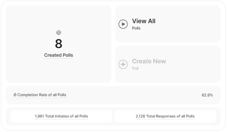
This tile gives you a brief summary of the most important topics related to the Polls feature. You will be able to:
- View the number of created polls
- Easily be forwarded to the actual module and view all your polls.
- Create a new poll, if there are any remaining slots.
- Check out the average completion rate of your polls, the number of total initiations, and the total responses of all your polls.
Important Note:
- This tile is totally independent from the selected date-range in the header and from the status of your Polls (no matter if they are paused or running).
- Hover over the polls counter for the "Increase Limits" button to emerge which gives you the option to upgrade and get higher limits.
- Everything about the corresponding functionality of this module and much more can be found here.
Session Recordings

This tile shows you an overview of the current situation of your Session Recordings feature. You will be able to:
- View the number of current session recordings recorded.
- Get an overview of how many unseen recordings there are overall. Clicking on the counter will redirect you to the full list of recordings, filtered to only show the unseen ones.
- Pause/resume the session recordings feature as a whole.
- See the number of starred recordings overall (the ones that you considered important/interesting and marked with a star at some point).
- See the average duration of all recordings.
Important Note:
- This tile acts completely independently from the selected date range.
- The average duration of the recordings does not always reflect the actual average time spent on the website. This applies only for the sessions that have been recorded, so make sure that the recording settings are as desired before referring to the average duration of your sessions (e.g. if you have set them to only record sessions on specific pages, the average duration will reflect only those visited pages and not your entire website).
- Hover over the Session Recordings counter for the "Increase Limits" button to emerge which gives you the option to upgrade and get higher limits.
- Everything about the corresponding functionality of this module and much more can be found here.
Funnels

This tile briefly presents you the most important KPIs relating to the Funnels feature. You will be able to:
- View the number of currently created funnels.
- Easily be forwarded to the actual module and check all your funnels.
- Create a new funnel, if there are any remaining slots.
- Check out the highest conversion rate of your active funnels and also the average conversion rate of all funnels (no matter their status)
Important Note:
- This tile is completely independent of the selected date range.
- Hover over the Created Funnels counter for the "Increase Limits" button to emerge which gives you the option to upgrade and get higher limits.
- Everything about the corresponding functionality of this module and much more can be found here.
Heatmaps

This tile briefly shows you the most important KPIs related to the Heatmaps feature. You will be able to:
- View the number of currently created heatmaps.
- Easily be forwarded to the actual module and check all your heatmaps.
- Create a new heatmap, if there are any remaining slots.
Important Note:
- This tile is totally independent of the selected date range.
- Hover over the Created Heatmaps counter for the "Increase Limits" button to emerge which gives you the option to upgrade and get higher limits.
- Everything about the corresponding functionality of this module and much more can be found here.
Event Tracking
This tile briefly presents you with the most important KPIs related to your Event Tracking feature. You will be able to:
- View the number of currently tracked events.
- Go to the actual module and check all events within a table.
- Pause/resume the event tracking feature as a whole. You will be presented with the options to disable/enable only the tracking of your manually added events, or the auto-identified ones, or both at the same time (note that this does not apply to Wix sites, on which only the auto tracking of events is possible).
Important Notes:
- This tile is totally independent of the selected date range.
- The limit for the events included is on a monthly basis. Resetting your data will not reset the counter of the fired events. It will start tracking again next month, or from the moment an upgrade takes place and the limit is lifted.
- Hover over the All Triggered Events Tracked counter for the "Increase Limits" button to emerge which gives you the option to upgrade and get higher limits.
- Everything about the corresponding functionality of this module and much more can be found here.
Surveys

This tile gives you a brief summary of the most important topics in relation to the Survey feature. You will be able to:
- View the number of currently created surveys.
- Easily be forwarded to the actual module and check all your surveys.
- Create a new survey, if there are any remaining slots.
- Check out the average completion rate of all your surveys, the number of total initiations, and sum of responses overall.
Important Note:
- This tile is totally independent from the selected date range and from the status of your Surveys (no matter if they are paused or running).
- Hover over the Created Surveys counter for the "Increase Limits" button to emerge which gives you the option to upgrade and get higher limits.
- Everything about the corresponding functionality of this module and much more can be found here.
Pages Dashboard

The Pages Dashboard provides an overview of your website's pages, allowing you to analyze various page-specific metrics. It is a valuable tool for website owners and administrators to track and analyze the performance of individual pages and make data-driven decisions to improve the user experience and drive desired actions on their website. To view more detailed information about your website pages, you can also go to the Pages module.
Here's a breakdown of the information you can access on the Pages dashboard:
- Page URL: Shows the list of page URLs and the current default sorting is by descending number of visits
- Page Views: This metric shows the total number of page views (formerly "visits") each page URL has received during the selected time period. It helps you understand the popularity of individual pages. The column header shows the sum of all page views.
- Page / All Page Views: This shows you the number of page views the page has received in the selected period of time and sets it into relation to the overall website’s traffic in the selected time period ( in % ).
- Visitors: Shows the total number of visitors(both new and returning) who visited each page URL. The column header shows the sum of all visitors for all pages.
- Av. Page Session Duration: This provides the average duration of user sessions on each webpage, helping you understand how engaging and effective your pages are in holding visitors' attention. The column header shows the average page session duration of all pages.
- Page's Top Referrer: This shows the primary source or referrer for each page URL. It can be helpful in understanding how visitors are finding and arriving at your pages, whether through direct visits, search engines like Google, or other referral sources.
To delve deeper into a page's traffic sources, click "Show all page's referrer" beside any listed referrer under this column. This link leads directly to the Referring Sites tab within Pages, where you'll find a comprehensive breakdown of all contributors to the page views. - Direct Page Views: This indicates the number of page views generated when visitors enter the page's URL directly into the browser bar.
- Page's Bounce Rate: This shows the bounce rate associated with each page URL.
Page's Events: This new column displays direct links to page’s events. Clicking any of these two options will lead you to their designated tabs under Event Tracking:
- Show Auto-Tracked Events
- Show Manual-Tracked Events (not available on Wix)
Additionally, you can now create and apply visitor segments to the Pages Dashboard. These segments allow you to filter and analyze page data based on specific criteria or characteristics of your visitor groups. You can find the visitor segments icon in the upper right corner of the dashboard. Everything about the visitor segments can be found here.
The new refresh button is located at the top right corner next to the date selector. It allows you to update the data instantly within your Pages Dashboard without reloading the entire page.
You can also customize the number of entries shown per page and easily navigate through the data using pagination.
You have the option to download your data in various file formats, such as CSV, PDF, PNG, or XLSX, depending on your personal preferences. This flexibility allows you to choose the format that best suits your needs and makes it convenient for you to work with the data in the way that is most comfortable or compatible with your tools and applications. Note: Exported data will only include the current table page.
Important Notes:
- This report block is totally dependent on the selected time period.
- Select columns offer the option to sort the data, providing a tailored approach to organizing and navigating through the information. The current default sorting of the pages dashboard is by descending number of page views.
- There are two ways that you can filter the data that you can see on this section:
- Add advanced filters to specify your results and/or group pages by page level
- Add filter by categories and defined values
Create New Dashboard

The "Create New Dashboard" feature offers the ability to craft custom dashboards and grant access to existing website contributors. Whether utilizing default report blocks for quick insights or customizing the dashboard to specific needs, it offers a versatile approach to gaining a deep understanding of website performance.
This flexibility ensures that users can swiftly access relevant metrics, empowering informed decision-making and fostering a cohesive understanding among team members and contributors.
Important Note: Access to this feature requires the purchase of a minimum pricing plan.
Some General Hints
- A custom dashboard can only be created and seen by the website admin. Here are the other roles of an admin:
- Can edit the name of the dashboard
- Can add report blocks from default report block selection
- Can move & delete report blocks
- Can define report-specific filtering if available for a report block (i.e. by URL, etc.)
- Can allow website contributors to view a dashboard
- Website contributors that you grant access to this dashboard as a dashboard viewer, will only see the exact data you are filtering/segmenting for. Dashboard viewers do NOT have the ability to update the dashboard's data nor can they click on links taking them to other features inside the platform.
- When clicking on “Create New Dashboard” and you are not subscribed to the required minimum pricing plan, a premium modal will appear, displaying details about the required plan, your current plan, and an "Upgrade Plan" button.
How to Create a New Dashboard
Creating a new dashboard lets you see and understand data in your own way. This guide will walk you through making your dashboard step by step, so you can organize and understand data for better decisions. Whether you're experienced or new to this, the guide makes creating your dashboard easy, turning data into useful insights.
- Tap the Create New Dashboard button and give your dashboard a meaningful title up to 50 characters long. This makes it easier to identify and organize your data at a glance.
- Once you create your new dashboard, you'll enter "edit mode." Here, you can freely add report blocks and tailor your dashboard to perfectly suit your needs.
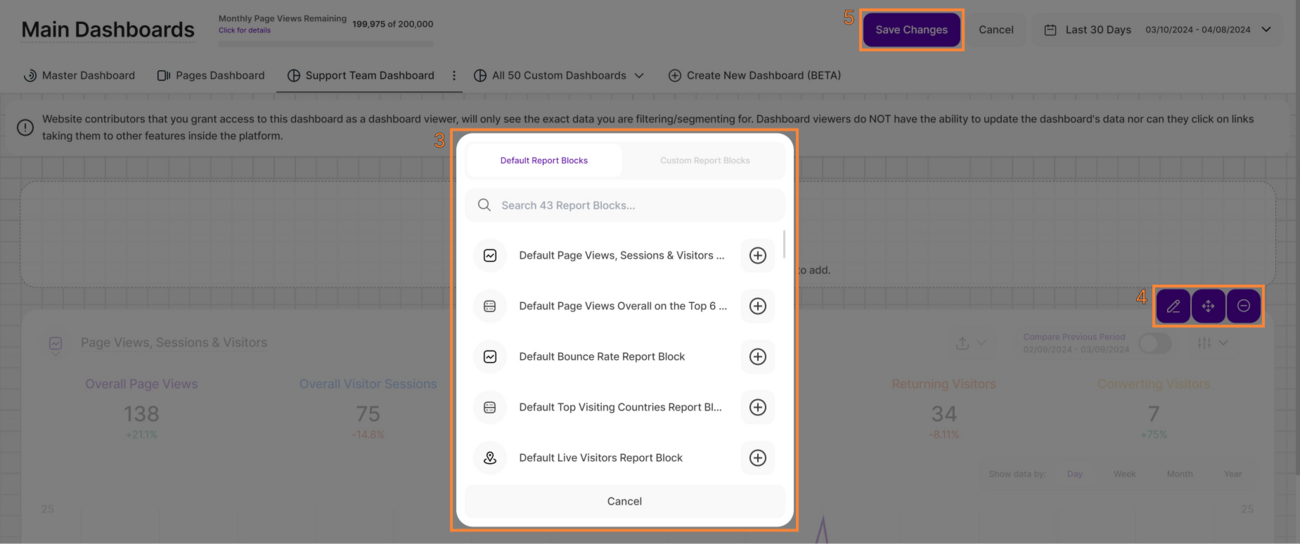
- Click the Add Report Block to Custom Dashboard button to open a modal with two tabs, where you can browse and select the report blocks you want to include:
- Default Report Blocks: These are the pre-existing report blocks available throughout the platform, totaling 43 at present.
- Custom Report Blocks: This option will be available soon, offering additional customization.
Hint: Hover over a report block for a quick preview.
- After adding the selected report blocks, you will see additional three icons on the top right of each report block implying the actions below:
- Edit Shown Data In Report: This allows you to modify the data displayed within the report(only available on some customizable report blocks).
- Move Report Block Within Custom Dashboard: Enables you to reposition the report block within the dashboard.
- Remove Report Block From Custom Dashboard: This action removes the specific report block from this dashboard only, without affecting its existence elsewhere.
- Once you've completed the necessary edits and adjustments to your dashboard, click on the Save Changes button located in the header.
Dashboard Options

You can control the settings for each custom dashboard by accessing the three-dot menu, where the following options are available:
- Edit Dashboard Name: Modify the name of the dashboard within a maximum limit of 25 characters.
- Edit Dashboard’s Data & Reports Blocks: This option leads you to the custom dashboard's edit mode, allowing you to manage report blocks as outlined earlier.
- Edit Dashboard Access (not applicable for Wix/3As due to no existing contributors there): Enable sharing the custom dashboard with EXISTING website contributors.
- Delete Custom Dashboard: Confirm the deletion action with a secondary confirmation. Only the creator can delete the dashboard, and once deleted, access will be revoked for any users who had permission to view it.
Share Dashboard

A custom dashboard can only be created and seen by the website admin. The admin can open the option “Share Dashboard”, which will list ALL active website contributors with the default status “No Access”.
The admin can give a website contributor access to the dashboard by selecting “View Only” on the drop-down menu. The list of website contributors is text searchable.
The admin can access the website contributor overview directly from this modal. Tap the “Manage Website Contributors” button to view the list of contributors, change their role or invite a new contributor. You can read more about the different roles and how to add website contributors here.
The admin needs to confirm the entries by clicking on the button “Save Changes” in the lower right corner of the modal.
Customize Report Block Names

You can now personalize the names of the report blocks in the custom dashboards for tailored insights. In the custom dashboard’s edit mode, you can see the report block’s (RB) name displayed as a “field.”
Follow these simple steps to edit the Report Blocks name:
- Click the pencil icon.
- Tap the report block name field and type in the preferred name.
- Tap the checkmark icon to save the changes or the X icon to discard them.
Alternatively, you can click the “Save Changes” button on the top right of this view. Once saved, you’ll see a confirmation “Your changes were saved successfully!”.
Important Notes:
- Access to the Custom Dashboard feature requires the purchase of a minimum pricing plan.
- Changes made to the Report Block names apply only to the custom dashboard. These changes do not impact the default naming of the Report Blocks (RBs).