- Frequently Asked Questions
- All About Features
- How to Install the Tracking Code
- User Guides
- Integrating With Other Platforms
- Legal, Data Privacy & Certificates
- White Label Analytics
- Glossary
- Affiliate Program
- Contact
Devices
Everything About the Devices Used to Access Your Website
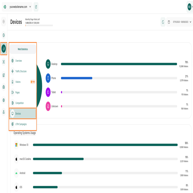
Within the Devices feature of the website statistics module, you have four sections that deliver almost all the data you need about the devices used by your visitors to visit your website:
Set the Time
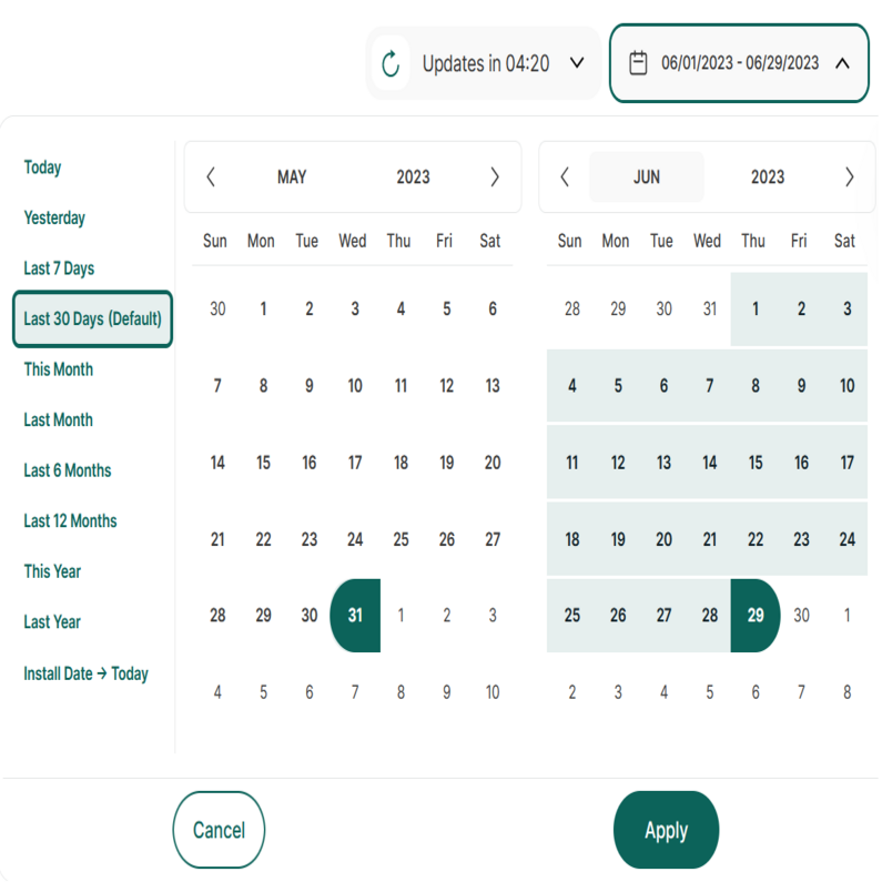
Right above the tiles, you can see a date-selector icon. This enables you to select a certain time period, or specific day, for which you want the Dashboard's data to correspond. It is crucial to limit the presentation of data to specific dates or timeframes during which you executed potential campaigns or implemented other strategies. This will allow you to assess the effectiveness of these actions and use the insights gained for future planning.
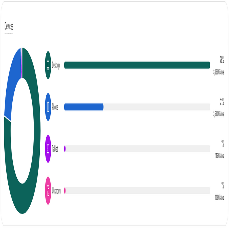
The first chart on this page gives you a simple yet powerful overview, featuring both a donut chart and a bar chart, showcasing the devices used by your website visitors. When you hover your cursor over each section of the donut chart, the percentage related to the use of this device type and the overall number of visitors will be displayed.
Every bar in the bar chart stands for a different device type. On the right, you can see the percentage showing how much of the visits came from that device. Right below it, you'll know how many visitors used that device.
This information can help you decide if you need to improve your website for a specific device. For example, if you notice that many visitors are using mobile phones to access your site and your site isn't well-optimized for mobiles, you should consider making improvements. This will enhance the user experience and potentially increase traffic to your page.
Important Hints:
- If you move your cursor over a bar or a section of the donut chart, it will display the exact number of unique visitors using this device type and the percentage of your overall unique visitors visiting with this device type – a "78%" hence means that 78% of your overall unique visitors have used this device type.
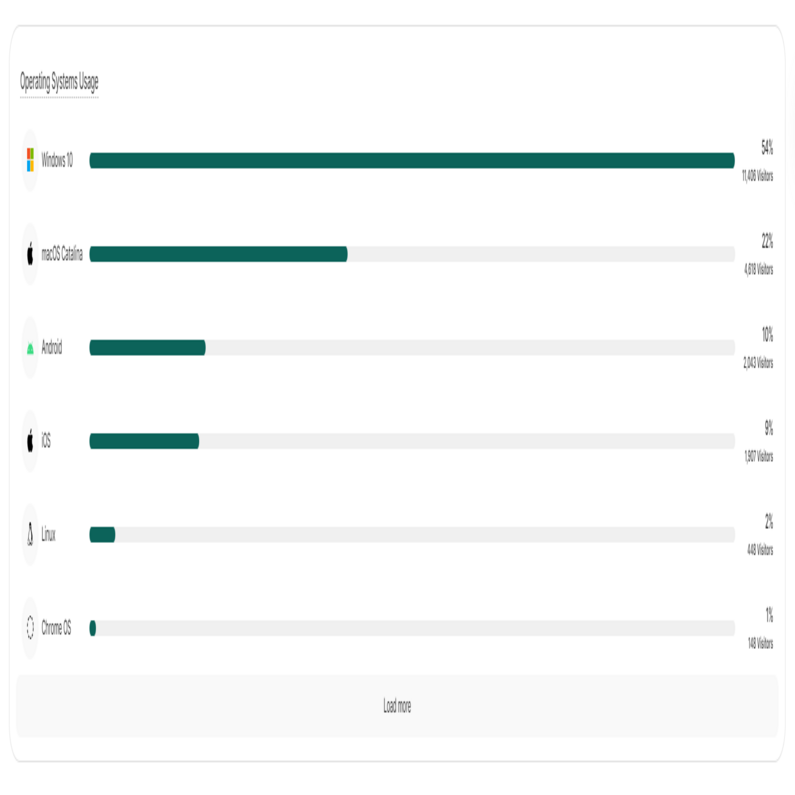
This bar chart provides you with a list of the Operating Systems (OS) used by your visitors to browse your website. Each bar represents a different operating system. On the right of each bar, you can see the percentage showing how much of the visits came from that operating system. Right below it, you'll know how many visitors used that OS.
This illustration will help you see whether you should optimize your website for a certain OS, as most of your visitors use it.
Important Hints:
At the bottom of the graph, you will find a "Load more" button. Upon clicking this button, the graph will extend downwards, displaying more Operating Systems that were used by your visitors.
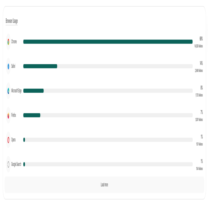
In this bar chart you are being presented with a list of the browsers used by your visitors to access your website. Each bar on the chart represents a distinct browser. The percentage shown next to each bar indicates the proportion of total visits attributed to that browser. Right below it, you'll see how many visitors used that browser type.
This figure helps you to see whether you should optimize your website for a certain web browser, as most of your visitors use it.
Important Hints:
- At the bottom of the graph, you will find a "Load more" button. Upon clicking this button, the graph will extend downwards, unveiling more browser types that were used by your visitors.
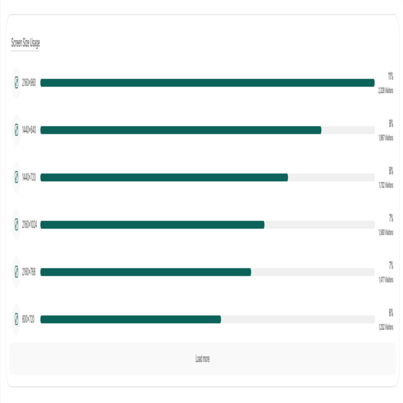
This chart shows the ratio of which screen sizes or display resolutions were used by your visitors who accessed your website. Each bar represents a different screen size. The percentage shown next to each bar indicates the proportion of total visits attributed to that screen size. Right below it, you'll see how many visitors used that particular screen size or resolution.
This illustration assists in determining whether you should optimize your website for specific screen resolutions, given that a significant number of your visitors utilize those resolutions. If you notice a substantial portion of users employing a screen resolution that your website isn't currently optimized for, it's advisable to make the necessary adjustments.
Important Hints:
- At the bottom of the graph, you will find a "Load more" button. Upon clicking this button, the graph will extend downwards, unveiling more screen sizes that were used by your visitors.


