
- Frequently Asked Questions

- All About Features
- How to Install the Tracking Code
- User Guides
- Integrating With Other Platforms
- Legal, Data Privacy & Certificates
- White Label Analytics
- Glossary
- Affiliate Program
- Contact
Overview
All the Most Important KPIs of Your Website's Performance at a Glance
What It's All About

Within this web statistics overview, you are being presented the most useful KPIs about your website's traffic, on a selectable timescale:
- Overall Visitors: The sum of all types of visitors (new, returning, converting) that have visited your website during the selected time period.
- Returning Visitors: Shows how many visitors have visited your website at least 2 times.
- New Visitors: Shows the total of visitors that have never visited your website before (Unique visitors).
- Sessions per Visitor: Shows how many sessions your visitors produced on average on your website in the selected time period.
- Page Views: Shows how many times the pages of your website were viewed throughout time.These are not unique page views. If the visitor reloads a page, or visits a page multiple times these count as additional page views.
- Pages per Session: Shows how many pages are viewed on average per session of your visitors. This number is calculated using all your visitors in the selected time period.
- Session Duration: Shows how much time visitors spend on your site on average (MM:SS) in the selected time period.
- Bounce Rate (%): The percentage of visits when the visitor left your website after only a one-page view. It does not matter how long the visitor was on the page or how they left. We call it a "bounce" if it is a visit with only one interaction with your website.
Traffic is the soul of your website. If there are visitors, there will be clients. Use this information to check how the performance of your website has reacted to actions that you took.
Important Hints:
- Each small graph can be expanded. The expanded graph will always appear on the left of the screen. When one of the graphs is expanded, the preceding one is immediately collapsed.
- Graphs that contain an average, will not take into account the zeros to be calculated (where applicable). For instance, if the selected time range is last 7 days, but there are visits only for today and for the 4th day back, and 0 data for the others, the averages will be calculated using only these 2 days.
- The average session duration will not take into account the sessions with only one visited page. Therefore, it may display a not so accurate time for one-page websites (or sessions that contain only one visit), unless the site is reloaded multiple times. This happens due to the fact that the time spent on the site is deducted as the sum of the exact time of a visit on the first page and the exact time on the next page(s).
- The percentages are shown in green or red, depending on the increase or decrease of data within the selected period.
- The percentage color for increasing / decreasing the bounce rate will be reversed, since a decrease in bounce rate indicates an improvement.
- If one of the lines in the graphs, green or light green, maintains a level 0 for the entire selected period, the percentage comparison is not applicable.
Set the Time

Right above the tiles, you can see a date-selector icon. This enables you to select a certain time period, or specific day, for which you want the dashboard's data to correspond.
It is crucial to limit the presentation of data to specific dates or timeframes during which you executed potential campaigns or implemented other strategies. This will allow you to assess the effectiveness of these actions and use the insights gained for future planning.
The date selector allows you to pick the earliest possible start date, the day this feature has been released. If there is a data reset event for your site (which took place after the launch date), then the start date for data analysis in this view will be the day the reset was accomplished.
You can also choose whether you want to show the data by day, week, month or year.
Important Note: The app now remembers previously set segments, filters, filter templates, and date intervals, even when you navigate away from the page, log out, or log back in. When your session expires or you close the tab, it automatically switches back to the default setting of "Last 30 Days."
Compare Your Data With a Click
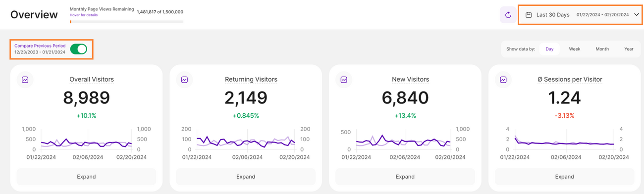

At the top right of this report block, you’ll find the Compare radio button that enables the following data comparison options:
- Compare Previous Period: Compares the current data to the previous period (if it exists).
- Compare Year over Year: Compares the current data to the same period of the previous year(if it exists).
You can now compare your current data to the previous period or compare it year over year. You’ll also find the dates covered by the previous period or year, for example, 01/22/2024 - 02/20/2024.
This enables you to get a better view of your current data compared to the previous equivalent period or year. The lines in lighter shades represent the data from the previous time period or year. Hovering the lines will show you more information.
This will grant you the opportunity to see how your KPIs have developed over time.
Some General Hints


- Hover the mouse over the name of the block or tile to trigger a tooltip containing a description of the report block, important hints, and a link to the glossary.
- Hovering the mouse over the graphs will display additional information, including the selected date and the total counts for each Key Performance Indicator (KPI) for that date. If the comparison feature is enabled, it will also show the data for the previous period or year along with the corresponding percentage change.
- In the upper right corner of each view you have the "Reload" icon: The turning arrow will refresh the entire page on click. You can manually refresh the data as needed.