Editorial Staff April 27, 2020
Heatmaps are a website owners best friend, and these website heatmap examples will show you why.
Simply put, they're a powerful data analysis tool that enables anyone - and i mean anyone - to understand how internet users interact with their website.
This is because heatmaps are a lot more visual than your usual analytics reports.
So this makes them more accessible, particularly for people who are not accustomed to analyzing data.
In this blog, you'll find an introduction to heatmaps, as well as a few striking website heatmap examples that really bring the power of this TWIPLA feature to life.
Let's dive in!
Unlock Your Website's Full Potential
Our advanced website intelligence solution will enable anyone to grow their website quickly - all while also staying data privacy compliant!

Introducing Heatmaps
Before we jump into our website heatmap examples, let's get to grips with the basic first.
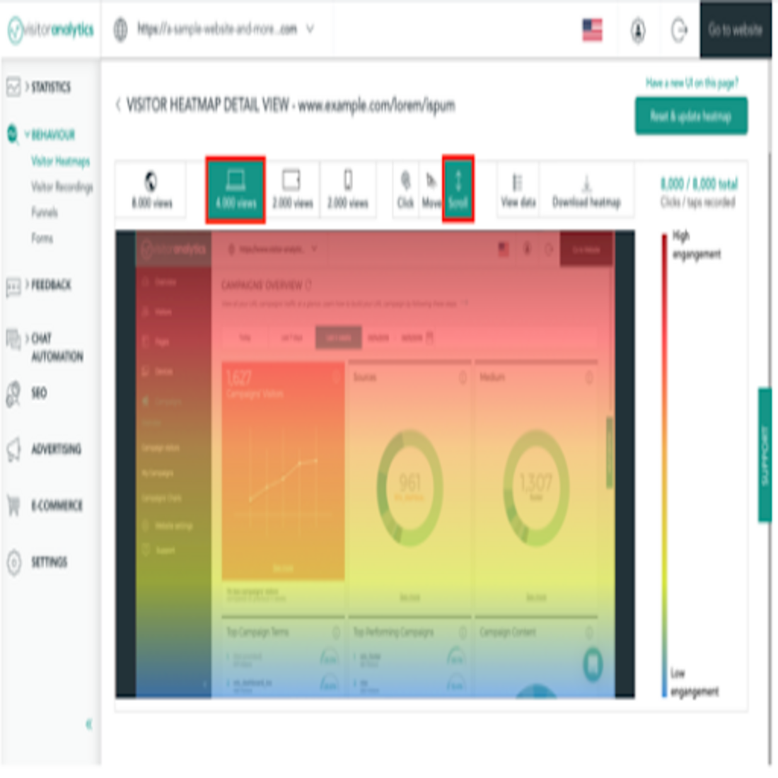
Heatmap colors range from dark red to cold blue, to indicate the level of interaction with a page element. You can easily see your website hotspots, the way users navigate and also the areas that are most or least interacted with. The warmer the colour, the more the interest.
Based on this color scheme, you can adjust the website design to match the attention focal points shown in the heat map. Moving important elements from the cold (blueish) areas to the hot (red) areas would be advised, and you'll undoubtedly see results.
History of Heatmaps
The term heat map or heatmap was trademarked by Cormac Kinney in 1993, and the first large-scale application of it looked like a table of colored rectangular cell blocks. The purpose was to try to show data from stock markets in a user-friendly way that could then help identify trends and beat financial markets. Simply put, they were data visualizations that used color to represent values in a matrix.
30 years later, they have earned a place in the website analytics niche, too.
Five Heatmap Types
There are at least five different types of heatmaps available from most heatmap tools:
- Click maps show where on a certain page visitors click most often. The areas with the most user clicks will display a “hotter” color.
- Movement maps track all mouse movement across the page and also show the most hovered over elements
- Tap maps are the equivalent of click maps, but for mobile devices. They instead track screen taps.
- Scroll maps are a measurement of scroll depth. They use colors to display where most users stop scrolling. With scroll maps, the above the fold section of the page will, of course, be the hottest. The footer will, most likely, be the coldest, as less people scroll to the end of the page.
- Attention heatmaps are a type of tool that only some heatmap software offer. They adjust data from scroll maps to display colors also based on time spent on each section of the page.
Why Use Heatmaps?
Website heatmaps give you fast access to insights about how your website is being used. You may get similar data from website visitor session recordings, but you probably won’t have time to watch thousands of recordings one by one. Heatmaps function as aggregated data of these recordings and provide information at a glance.
You can find out the following things about your users and take action:
Are they interacting with the important elements on your page: i.e. CTAs, buttons, videos etc.? If not, change their size, color, fonts or position.
Do visitors fail to reach content you think is important, by not scrolling enough? If so, move this content higher up on the page.
Do visitors click on non-clickable elements? Then either make them clickable or change their design.

Heatmap Examples and Case Studies
Heatmap Example 1: Dan, a Blogger, and his Poorly Formatted Text
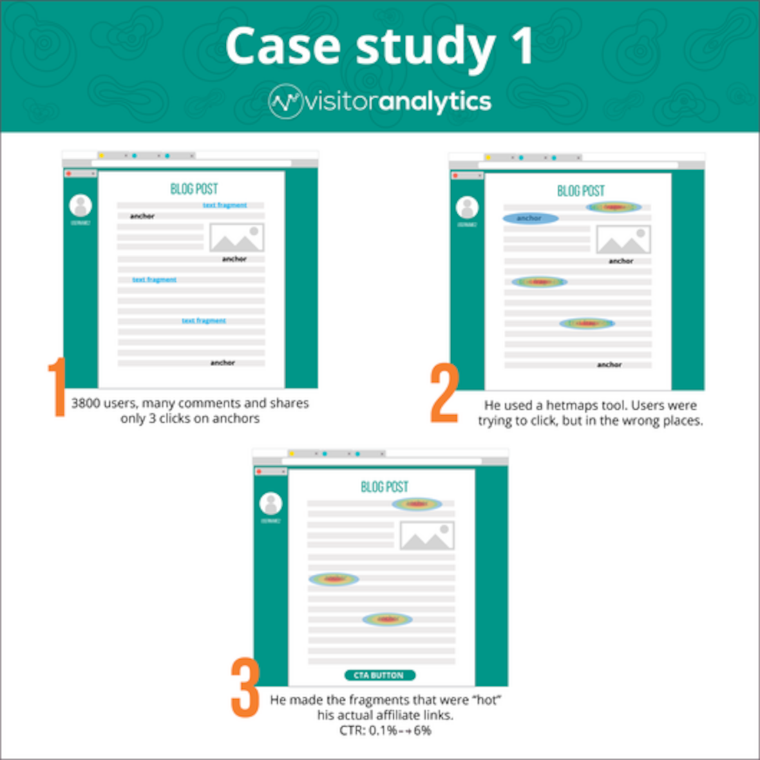
Dan had a moderately successful blog and tried to monetize it by joining affiliate programs. He started linking anchor texts from his posts to his partner pages so as to earn commission.
One month later, more than 3,800 users had read his brilliant review of a recent best selling e-book. There were also many comments on the post and the content had been shared by some. Yet, looking at his analytics, Dan saw that only 3 visitors had clicked the affiliate links in his text. He thought it was too little, but still had no idea about the reasons behind this.
For his next post, he also used a heatmap tool. What he found, surprised him. Looking at the click heatmap for the page, he noticed users were actually trying to click, but in the wrong places. Some text fragments were highlighted in such a way that people thought they were clickable. On the other hand, the styling of the actual links didn’t get enough attention and clicks.
Dan decided that the easiest way to solve this, was to make the fragments that were “hot” his actual affiliate links. He also decided to use that particular styling on all his future affiliate links. For good measure, he also added a visible CTA button to the text. The results were massive. His CTR went from less than 0.1% to 6% as a result.
Heatmap Example 2: Company X's CTA Button
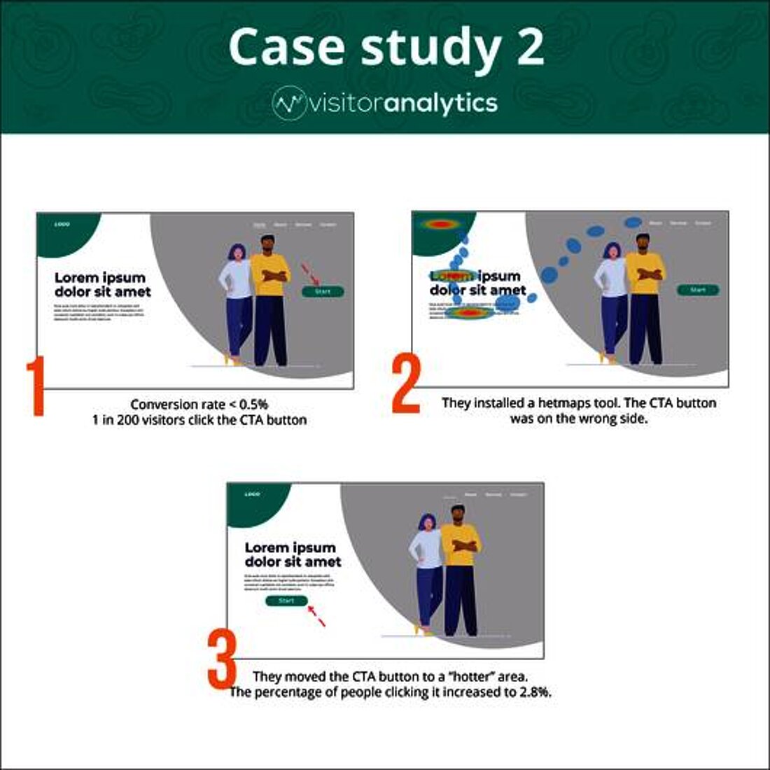
Company X had a very organized and well-structured website, and yet they were still struggling to get conversions from their visits. They placed a CTA button on the homepage, but, even so, their conversion rate was under 0.5%. Indeed, only 1 in 200 visitors would actually click the CTA button.
To understand why, they installed a heatmap tool and then used it to then make a movement map. After one week, they were able to notice that people were hovering a lot more on the left side of the homepage. But the CTA button was on the right. So the solution was to move the button to a “hotter” area. After another week, the percentage of people clicking it increased to 2.8%. This had an immediate effect on sales.
Heatmap Example 3: Company Y's Cold Scroll Map
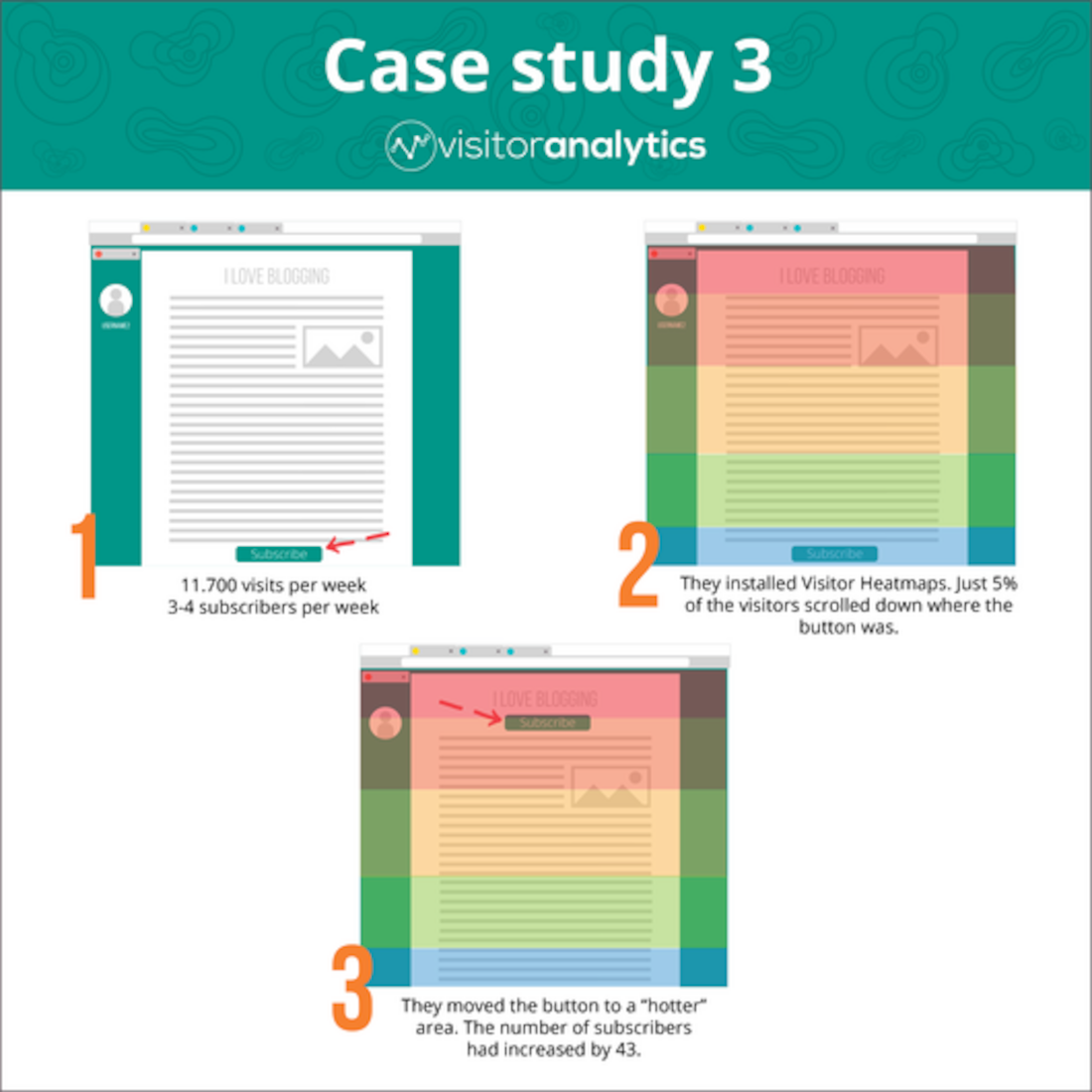
Company Y published a series of blog posts on subjects connected to their product. At the end of each post, they would then encourage users to subscribe to their newsletter. Although, on average, they welcomed 11.700 visits per week on their blog posts, new subscribers were 3-4/week.
In order to find out why, they used Visitor Heatmaps and found out that just 5% of the visitors scrolled down to where the “Subscribe to Newsletter” button was. So they placed a copy of the same button higher up, under the first paragraph of their blog posts, in a “hot” area. The next week after the change, the number of subscribers had increased by 43.
Unlock Your Website's Full Potential
Our advanced website intelligence solution will enable anyone to grow their website quickly - all while also staying data privacy compliant!
Put these Heatmap Examples into Practice with TWiPLA
No doubt these website heatmap examples have convinced you of the power of this tool.
Keeping an eye out for errors and opportunities on your website is crucial for its success. They help you, as a website owner, make critical business, design, and also technology decisions fast. You can use them as a diagnosis tool, and then find out what is wrong with your website’s performance.
The information that heatmaps provide is intuitive and also has a lot of uses. They are a great addition to have in your arsenal of analytics tools.
The purpose of TWIPLA is to give users a truly all-in-one app, that can combine data from heatmaps with other relevant sets of stats: visitor paths, number of unique visitors and other user behavior features including funnel analytics.
Watch the video to understand more about how heatmaps from TWIPLA work.
Share article
Get Started for Free
Gain World-Class Insights & Offer Innovative Privacy & Security


Stay Updated & Get Inbox Insights
Keep pace with the world of privacy-first analytics with a monthly round-up of news, advices and updates!


