Heatmaps
Understand Page Engagement At a Glance
Use these Color-Coded Graphics to Guide UX Improvements
Easily Visualize Traffic Activity
Heatmaps are an intuitive way to understand webpage visitor clicks, scrolls, and mouse movements. Activate them to learn how traffic really engages with your website on a page-by-page level, and then use these insights to better achieve your business end goals.
Our heatmaps are easy to use and also simplify data analysis significantly. Generate one in seconds and then return once it's collected data. See how your pages are performing over any time period, and use these insights to enhance the user experience.
Why Use Heatmaps?
- Understand traffic behavior and traits at-a-glance.
- Optimize webpage design for a better user experience.
- Increase conversion rates by optimizing to engagement.
- Identify usability issues, bottlenecks, and pain points.
Discover Our Powerful Page Heatmaps
See Rich Visual Context for Ease of Analysis
Generate a Heatmap in Seconds
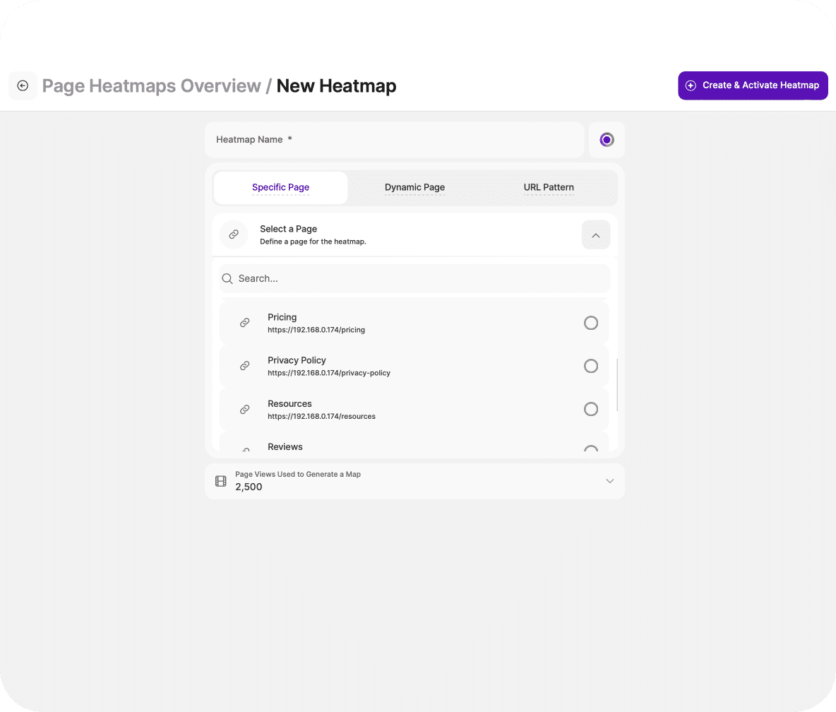
With TWIPLA, creating a heatmap is simple. Choose whether you want to generate one for a specific page or dynamic page. Then name it. Choose the color palette, and decide whether you want to limit data capture to 2,500 visits or increase to up to 8,000 views.
Alternatively, the UTM pattern tool also enables you to generate a heatmap that analyzes multiple similarly designed webpages at the same time. Simply input the protocol, domain, path, query string, or fragment. Then, activate the heatmap and move on with your day.
It'll now be ticking away in the background, collecting data up to the selected view count. But you can pause or reset data capture whenever you want. Our heatmaps really are as simple as that, but the insights they provide will up your optimization game remarkably.
Our User-Friendliness Extends Across the Platform
See Our Awards and User Reviews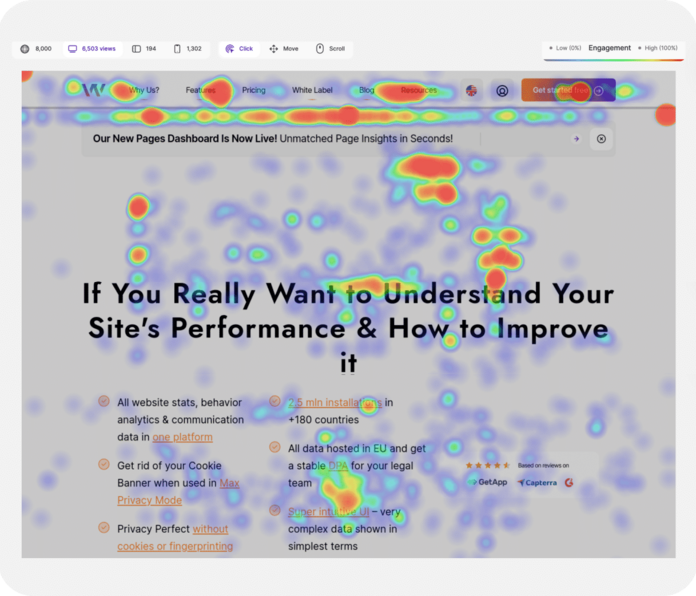
Quickly Grasp Traffic Behavior
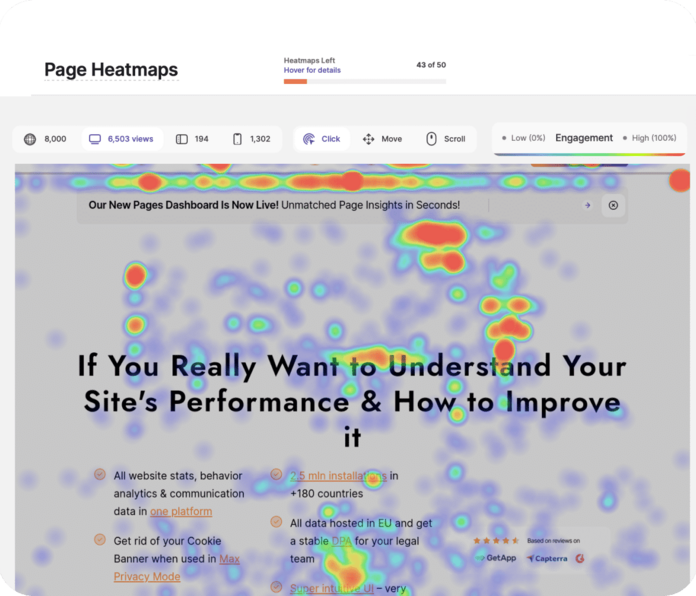
Heatmaps take complex traffic data and make it easy to understand. Simply put, they bring data to life! Jump into one, and you'll see intelligible data on the clicks, scrolls, and also mouse movements of all the internet users that have visited your webpage on its watch.
Use the color-coded visualization to instantly identify page areas and elements that experience high activity, and others that are ignored. Hot colors represent areas of high activity and cold areas low. And if needed, you can also download each heatmap as a PNG.
It's all very intuitive. But if you're less visually-minded, you can also look at the results in data table form, and download it for analysis elsewhere. Either way, you'll quickly identify ways to improve layout and performance, and to increase engagement where it matters.
Confirm Your Observations With Visitors Directly
Discover Our Visitor Communication Tools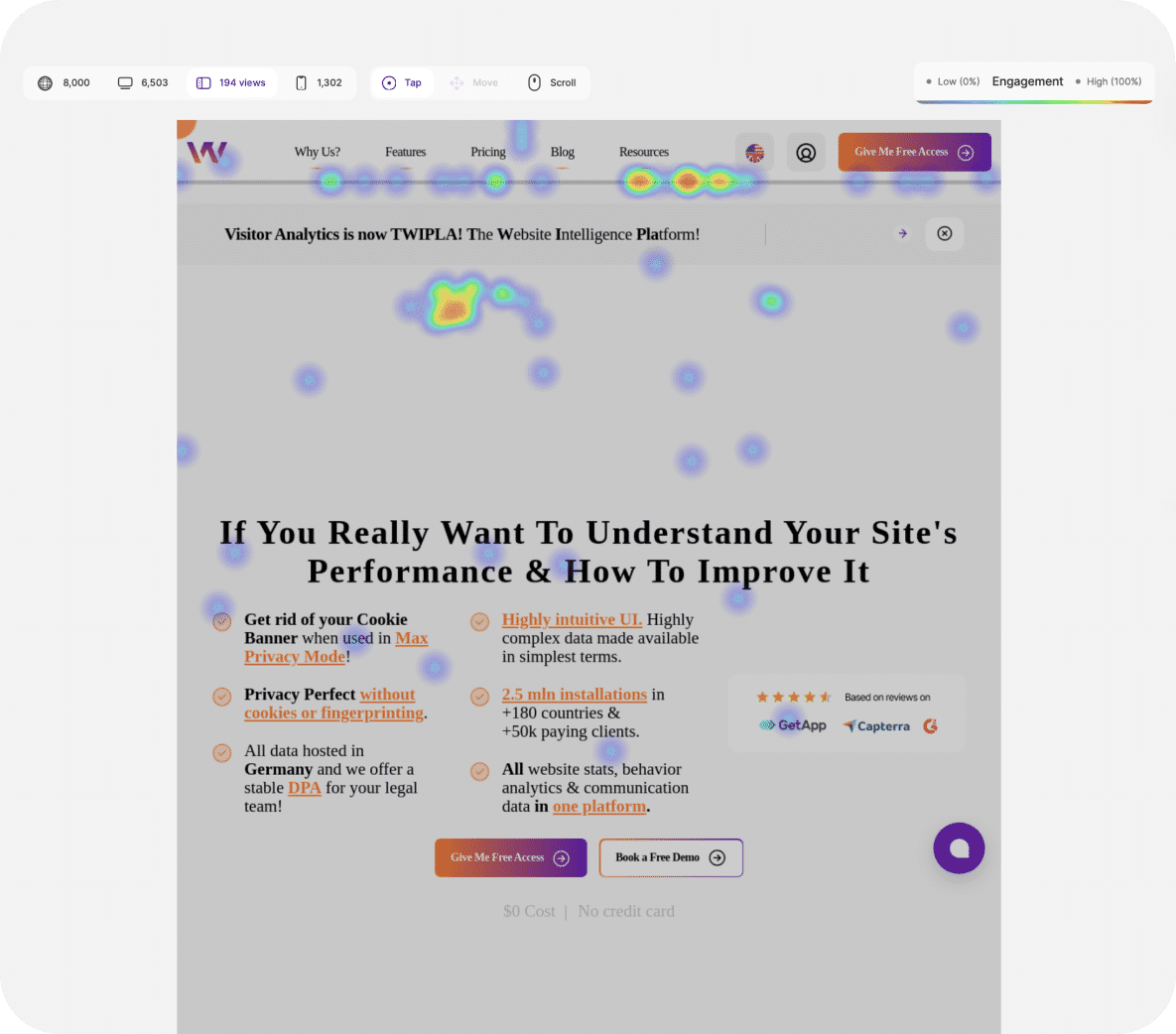
View a Heatmap for Any Device
With TWIPLA, you can quickly segment data by device. Toggle between desktop, smartphone, and tablet view. Grasp the diverse ways that visitors interact with your site. Then, use these insights to ensure responsiveness for popular devices, and prioritize resources.
Heatmaps are also a great way to identify device-specific performance issues. Think non-responsive elements or misplaced buttons that would otherwise remain invisible without device-level analysis. But with our intuitive tool, they become plain for all to see.
So use this feature to tailor content to visitor devices, and to the unique characteristics of their hardware and software preferences. Also ensure a great navigational experience for all, enhance accessibility, and retain the competitive edge you need!
Understand Website Performance from Every Angle
Discover Our Complete Website Statistics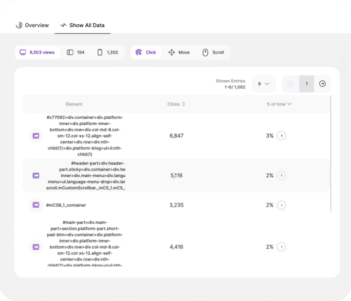
Identify Performance Issues
Our heatmaps make it very easy to also identify unusual traffic behavior. This makes them perfect for pinpointing glitches, bugs and also technical problems that are affecting the user experience, and causing visitors to lose interest in what they are doing.
So use them to find non-responsive elements that frustrate. Text or images that look clickable but aren't. Menus that look droppable but don't. Dormant social media icons. Use these insights to give users what they want, or adjust design to remove confusion.
Also, use them to clarify navigation - a crucial part of optimization. Scrolls reveal whether users reach key information, and mouse movements where their attention is. Then, use this insight to make key content more visible and redesign menus for better guidance.
Watch Videos of Real Heatmap Traffic
Discover Session Recordings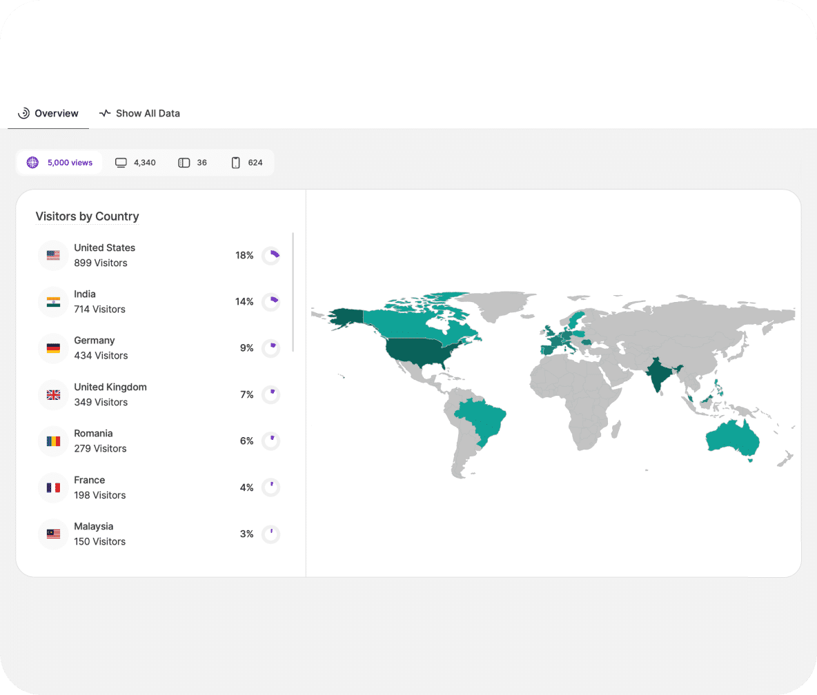
Map Out Your Global Reach
With one click, jump to heatmap locational information. View all your traffic sources of origin ordered in list form. Immediately see how visitors are distributed on a global map, with a mouse hover also revealing additional country-specific traffic data.
Instantly identify high traffic sources and prioritize marketing efforts, spending, and opportunities for localized promotions. Guide Local Search Optimization. Match site performance and design to the varying internet speeds and devices in popular source regions.
These are all crucial insights, but you can also use heatmaps to find other regions that need catering to. Tailor pages to language and cultural preferences. Identify products popular in specific regions, and use this data to also guide inventory and product modifications.
Turn Your Website into a Sales Pipeline
Discover Conversion Funnels
What Are Heatmaps? The Only Guide You Need
Heatmaps paint powerful visual stories about website visitor behavior. Read this guide to learn what heatmaps are and how to use them effectively in marketing.