- What are Heatmaps?
- Heatmaps: An Overview
- The Origin of Heatmaps
- Heatmaps: Popularity and Examples
- How do Heatmaps Work in Digital Marketing?
- Why use Heatmaps for Marketing?
- When to Use Heatmaps
- Problems with Heatmaps
- How to Get the Most Out of Heatmaps
- Heatmap-Led Roadmap for Website Improvements
- TWIPLA Heatmaps
- Heatmaps FAQ

What are Heatmaps?
Heatmaps are a powerful tool for understanding how internet users approach your website pages - what elements they click, how far down they scroll, what they interact with, and what they ignore.
They're a useful feature that comes with advanced website analytics tools like TWIPLA.
In this educational guide, you’ll find out what heatmaps are, as well as the different types that are available to digital marketers, and how to get the most out of them.
By the end, you'll be able to see for yourself how valuable heatmaps are when it comes to the fun task of optimizing your website and seeing it jump up the rankings!


Heatmaps: An Overview
Heatmaps - or heat maps - enable marketers, developers, and UX professionals to see how internet users interact with a website or application. What heatmaps are in essence is a powerful visual story that shows which areas are attracting user attention, which are being ignored, and these insights can be used to guide development.
Heatmaps record user behavior en masse, and this data is then superimposed over the webpage under investigation, in the form of a graphic that uses color intensity to represent the frequency of clicks, scrolls, taps, and mouse movement - some even use AI and eye-tracking sensors!
Today, they are usually generated with a full rainbow palette since the human eye can perceive more colors than shades of gray. Warm colors represent areas of higher user activity, while cool colors represent lower activity:

The Origin of Heatmaps
The term “heatmaps” is relatively new, having been trademarked by software architect Cormac Kinney in 1991 for a tool to help traders beat the stock market. Unfortunately, the company that bought it from him accidentally let the trademark lapse - hence why the term is used so widely today!
The concept is much older however, and is first credited to French statistician Toussaint Loua in 1873. He used a grayscale shading heatmap to visualize various social demographic changes across Paris.
As you can see, the early versions of heatmaps resemble a table of rectangular cell bocks. Today, they can be created by hand, but are more often generated using advanced heatmapping software.
Heatmaps: Popularity and Examples
What heatmaps are has changed over the years as the technology underpinning them has developed. They’re now highly versatile, and their capacity to supercharge the analysis of huge volumes of information has made them the most popular tool for data visualization and analysis out there today.
And since heatmaps are also both cheap and highly intuitive, they are a feasible option for practically any business. From marketing to finance, media, and sport, there’s no end to the list of industries that rely on heatmaps to turn raw data into powerful business intelligence, with some of the best examples (and close relatives) listed below:
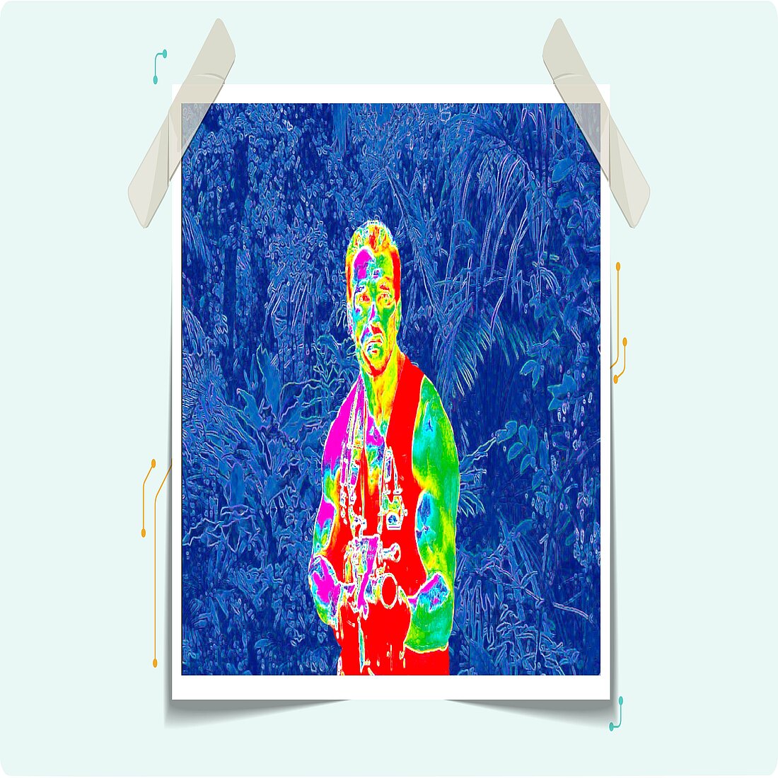
Infrared Imagery - Predator Vision
There’s something in those trees, and Billy would have had a much better idea of what it was if he was wearing infrared goggles.
Infrared goggles work by intensifying light signals. They take the ultraviolet, visible and infrared light spectrum and amplify it with electronics to create a richer visual picture of what’s in front of us.
What we see through infrared goggles is therefore very similar to heatmaps, and is still most commonly associated with Predator, Arnold Swarzenegger’s magnum opus on the virtues of boy scout training.

Weather Forecast Maps
Weather forecasts are the most common type of heatmap that we use in everyday life, and have been around in some form or other since 1975. They take huge quantities of meteorological data, and display it graphically over the earth’s surface.
Users can quickly see what the temperature will be anywhere in the world, as well as accurate forecasts on rainfall, wind speed and direction, atmospheric pressure, and so forth.
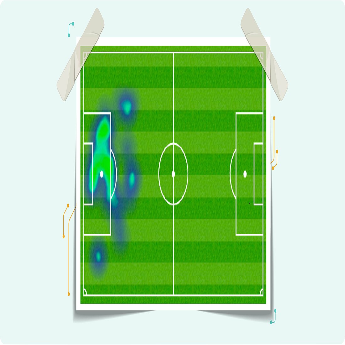
Sport Heatmaps
Tracking technology has been used in football (or soccer if you prefer) analysis for the past 20 years, with most top level players wearing the motion sensors that make heatmaps such an eye-catching and effective tool for analyzing players’ on-field performance. You’ll also find them in a wide range of other sports, such as rugby, hockey, and basketball.
They enable coaches, commentators and fans to easily digest player performance, such as how far they’ve traveled, when they were most active during a game, where they pass from, and how their positioning has changed over time.
The heatmap here shows footballer Manuel Neuer’s average position during a football match, and you can see clearly from the coloring outside the box why he’s known as a sweeper-keeper, given how far he often plays upfield!

Population Distribution Heatmaps
Population distribution is a great example of how heatmaps are used by statisticians, who were the first adopters of the concept back in the 1870s.
They take a map and paint population data over the top of it. This information could be anything from age or ethnicity to eye color or voting preferences, and enables the viewer to understand complex data quickly.
This map here shows the geographical prevalence of COVID across the US, with the darker colors showing higher levels, and the lighter colors showing lower levels.

Social Media Audience Heatmaps
Heatmaps have proven particularly useful for displaying data about busy trading periods, such as this social media audience heatmap.
Social media platforms can’t use a hand held clicker to record footfall, and heatmaps enable them to see clearly when their servers will be most busy during the day.

Retail Matrix Heatmaps
Heatmaps have proven to be really effective for the retail industry. Businesses can pull data from video recordings and generate heatmaps to show how long shoppers spend in store, and which products they interact with.
They can then use this information to improve the store layout, with the goal of improving the shopping experience, removing bottlenecks, increasing the sale of certain products, and so forth.
How do Heatmaps Work in Digital Marketing?
Sports heatmaps, population distribution maps, and weather forecasts are all well and good, but you’re here because you want to know what heatmaps are for modern marketers.
They generate website heatmaps that translate visitor behavior into color. These graphics display reds, oranges, and yellows over page areas that experience more user activity, and blues and greens over areas with less user activity. In areas with no activity, it leaves the space clear.
What Types of Website Heatmaps Exist?
What heatmaps are best at is making all the different user actions easy to understand, and this is because they display the clicks, scrolls, and mouse movement separately.
This means that there are a handful of different types, and it's vital that you select the right heatmap for your specific website intelligence objectives - if you don’t know exactly what you’re looking for, you simply won’t get the insights you need.
Desktop Users vs Mobile Users
Firstly, modern websites normally use dynamic content, since they have to be set up differently for desktop and mobile users. This is reflected in the heatmaps generated, which show the page under investigation as it appears for people using these two categories of devices.

Five Types of Heatmaps
Beyond the separation of desktop and mobile user data, there are five main types of heatmaps that can be used for website optimization. which are generated from different types of website visitor activity.
These are powered by two types of heatmap software. Data-driven software creates heatmaps based on real user behavior, and is the basis of clickmaps, scrollmaps, and mouse tracking maps. By contrast, attention mapping software tracks eye movement and general attention, and uses algorithms and AI to compare actions with wider browsing habits.
The data generated can be viewed in list form, or exported into a spreadsheet for further analysis. However most people prefer to view the generated heatmaps themselves, with the different types outlined below:
1. Click/Tap Heatmaps
What it shows: where visitors are clicking or tapping.
Click maps show the page elements that visitors click on the most, and typically use different shades of one color - the hotter the color, the more frequently they click. They are great for understanding how visitors navigate through your website, as well as for identifying which elements attract the most attention and persuade visitors to click through.
When to use click/tap maps:
- See whether users are clicking where you want them to, or are distracted by other elements
- See how users navigate the website, and make changes to improve the customer journey
- See how users interact with images, and where links should be added or removed
- See where the most important links should be to improve the conversion rate

2. Scroll Heatmaps
What it shows: how far visitors are scrolling.
Scroll maps show how far website visitors are scrolling down a webpage, and where they drop off - the hotter the color, the more internet users have viewed it. These maps are really useful for understanding and measuring how engaging your pages actually are, and you can use them to identify, remove, or improve issues that damage the user experience.
When to use scroll maps:
- Identify the ideal page length based on where visitors lose interest
- Identify where visitors are spending the most time, and what they ignore
- Identify “false bottoms” where visitors false believe they’ve finished reading
- Identify the best position on the page for key content or important CTAs
3. Mouse Tracking/Hover Heatmaps
What it shows: where visitors are moving/hovering their cursor
Hover maps show where their cursor sits when looking at your webpage - the hotter the color, the longer cursors are there. These maps follow the logic that if people hover their mouse over something, they are paying attention to it, and the information it gleans is useful, even if this logic doesn’t hold all the time.
The data collected gives you an idea of how visitors navigate around the website or web pages, so that you can set things so that it garners the most attention. You can also figure out if non-essential elements are distracting your visitors from the important ones.
When to use hover maps:
- Pinpoint where visitors position their cursor the most, and change the page layout accordingly
- Learn where visitors are looking when navigating around the website.
4. Eye-Tracking (Gaze Plot) Heatmaps
What it shows: where visitors are looking, the timeline of their gaze, and how long they look for
Eye-tracking maps overlay information about eye movement onto a webpage. This heatmap type normally requires access to the user’s camera or a special device, making it a less reliable heatmap for large data sets for the moment.
But by examining what visitors are focusing on during their first few seconds on a webpage, you can position the most important elements in their natural eye path, so as to increase conversion rates.
When to use eye-tracking maps:
- Identify what visitors are actually paying attention to
- Assess whether visitors are being distracted by non-essential elements
- Change the page layout to increase attention on the most important elements

5. Attention Heatmaps
What it shows: where visitors are drawn to on the page
Attention heatmaps let you see which parts of a webpage get the most attention. They combine website visitor data with AI algorithms, predictive data, and eye tracking to calculate which elements are attracting the most interest, which are being skipped, and display this data with a standard heatmap overlay.
When to use attention maps:
- Analyze long webpages to identify where internet users are losing interest
- Learn from expected attention time what content needs to be improved
- Identify what needs adding to increase conversion rates
Why use Heatmaps for Marketing?
Now that you know what heatmaps are, you’ll want to know just why they are just so crucial to modern marketing.
Websites are probably the most important digital platform for companies, but the competition for customers’ attention is greater than ever. As such, it’s vital that your website gets as much attention from visitors as possible, and analytics tools are there to provide information on how they arrive at your site, and what pages they look at.
These tools show you which pages get more visitors and are useful for identifying poor performing webpages. But they don’t show how these internet users are interacting with the pages of your website, nor do they help you understand why they’re leaving, or why the conversion rate is so low.
Heatmaps exist to help fill in these gaps, and provide marketers with an understanding of their website visitors’ point of view to determine what captures their attention. This intelligence can help you find out if people are having difficulty finding something on your website, or navigating with their chosen device, and you can then improve the user journey by giving them what they want.
The data is also broken down along demographic lines, enabling you to understand who interacts with your webpages, and in what ways. And, since you can identify where your audience is browsing from in the world, you can better meet the expectations of the people most likely to buy from your website.
Heatmaps help marketers to identify what’s working, and what isn't. You can use this data to make informed tweeks to the layout or content. And, by assessing repetitive clicking or other strange behavior, you can identify bugs, glitches, broken links, and other problems in the back end of the website.
What’s more, viewing data through a heatmap can reveal trends that you might not have even considered - opening up new avenues to explore. But the goal always remains the same - to find the right webpage layout, to ensure people click where you want them to, and to remove anything that reduces this conversion rate.
Ultimately, what heatmaps are great at is making otherwise boring or impenetrable information understandable, and are invaluable in the “deep dive” analysis stage of website optimization. They’re very intuitive - particularly for the visually-oriented - and most people immediately understand what the graphic represents.
And by making data science accessible to all businesses, they’ve become a popular tool for improving marketing effectiveness and resource allocation.

When to Use Heatmaps
You’ll want to use heatmaps when you have a specific website optimization goal in mind. In other words, what heatmaps are best for is finding answers to specific questions that you have about user behavior, and we’ve outlined these in the infographic below:
Best Marketing Use Cases for Heatmaps
Ultimately, what heatmaps are is a really useful tool to help you carry out specific website optimization work effectively, and are a marketer’s best friend when you’re doing any of the following things:
1. Website redesign
You’ve just given your website a complete makeover, but you need to know whether it’s actually engaging users. Heatmaps are the analytics tool that you should reach for in this situation, with eye-tracking or hover maps invaluable for seeing the website through their eyes.
2. Conversion rate optimization
Your website may look as good as anything you can find online, but this won’t help you much if the conversion rate of your CTAs is low. Put heatmaps on the case, and you’ll quickly be able to gauge the functionality of your site, and improve your webpages accordingly.
3. Underperforming webpage improvements
Analyze your website performance, and you’ll no doubt identify pages that aren’t pulling their weight. In these situations, you can generate a heatmap, and quickly work out what’s holding website visitors back from performing the actions that you desire.
4. Usability testing
The most important thing for your website is that it is accessible and intuitive for the average internet user. Heatmaps enable you to locate areas of confusion, which you can then rectify to improve the customer journey.
5. User experience improvements
Websites will look different on different devices and the page layout needs to be set up accordingly. Heatmaps arm you with the information you need to optimize your website, ensure multi-device and browser compatibility, and build a smooth navigation experience for your internet traffic.
6. A/B Testing
Heatmaps are really useful in A/B testing - or split testing - because you can quickly compare layout options for a page, and work out which version works best. You can test things like different color schemes, fold location, or the position of CTAs, and easily see which ones return a better conversion rate, before rolling this insight out around your website.
7. Content Marketing
You may think that all your content and CTAs are worded perfectly, but that doesn’t necessarily mean that the page is effective at conveying the information you want. Scroll heatmaps enable you to see how far users have scrolled through a page, so that you know which parts of the content they are focusing on, and when they lose interest - enabling you to remove “false bottoms”, improve the article, and draw attention to the CTAs that matter.
Problems with Heatmaps
Heatmaps are certainly effective when used by people with some understanding of what they’re looking for, but clicks, scrolls, and mouse movements only represent single data points - their main limitation is that they only show what’s happening, meaning that user intent is open to interpretation.
Heatmaps work by aggregating data from webpage visitors over time, meaning that they become more accurate when they have more data at their disposal. This can make them a poor tool in the short term since, for instance, they will not expose recent changes in user behavior, or will undervalue them.
This is particularly the case with the more advanced AI-powered attention and eye-tracking heatmaps, while mouse movement heatmaps rely on the somewhat dubious relationship between cursor positions and user attention.
Ultimately, the nature of what heatmaps are means that they need context to be insightful. They do enable you to quickly identify page elements that aren’t attracting the desired amount of attention, but they lack the context to explain why this is. The accuracy of data can also be skewed by variations in visitor device sizes and browsers, as well as by any moving page elements.
And without this context, heatmap data can be difficult to convert into reliable business intelligence. At worst, they can create false insights into user intent that can lead to counter-productive website optimization work that only makes problems worse.
As such, heatmaps can be an unreliable analytics tool when used on their own, and should always be paired with other tools.
How to Get the Most Out of Heatmaps
Heatmaps work best when used as both a diagnostics tool to figure out problems with a website’s performance, and a monitoring tool to audit user behavior, make a website more intuitive, and boost conversion rates.
They’re highly intuitive, but getting the most out of what heatmaps are capable of requires that you approach the data from the right angle. In essence, what this means is keeping these three questions in mind:
1. Are website visitors paying attention to important content?
This is your top priority, and can be best gleaned from scroll maps. You obviously want website visitors to be reading what matters most on the page, and can adjust the page layout if they’re not.
These adjustments should take into consideration the position of the average fold - the area that an internet user sees when they arrive on a page. This can be tricky today because of the sheer number of different screen sizes that people use, though 800 pixels is a good place to start.
When done effectively, you’ll either have the information you want website visitors to see right from the get go, or you’ll integrate other elements into the page so that they continue to scroll through to what’s important.
It’s normal with scroll maps for colors to get colder the further down the page, but you’ll want to check the proportion of internet users that drop away throughout the page, and to consider why they’re doing this - it might be because the content isn’t relevant to the title, for instance, or because there’s a “false bottom” - ie, your readers mistakenly think they’ve come to the end of the page.
2. Are website visitors clicking where you want them to?
Websites exist so that people can find information, sign up to a service, or buy something they want. In this context, click maps are great for seeing how effective your clickable page elements are at guiding website visitors towards this end goal.
Once you’ve generated a heatmap for the page(s) under investigation, you can use the insights it provides as a basis for future design work - the problem might be something as simple as confusing people with too many different CTAs, or using a font style that makes something look like it’s not clickable when it actually is.
And, once you’ve made some changes, another heatmap further down the line will enable you to see quickly whether these modifications have had the desired effect.
3. Are website visitors confused by non-clickable elements?
This question is linked to number two, but it's important enough to think about separately. Click maps will enable you to easily identify non-clickable page areas that are experiencing suspiciously high click activity.
See this from a user’s perspective, and you’ll understand how annoying it is to navigate a badly designed website, with confusing items that distract them from getting what they want, and it can cause them to leave in frustration.
Once you’ve identified problematic elements, you can then rectify them, improve the user experience, and better lead them towards what’s important to them.
Use Heatmaps With Other Analytics Tools
Beyond these questions, what heatmaps are capable of is enhanced considerably when used in conjunction with other website analytics tools. Ultimately, they’re the tool that you should lead with, since they’re great for identifying user behavioral trends that can be substantiated with other tools.
Heatmaps represent the activity aggregate of thousands of website visitors; you can take what you’ve learned from this data, and use it to inform your investigation into session recordings that follow the journey of individual users around the website.
This is a great way to zero in on the exact problem that needs addressing, and its heatmaps that give real value to session recording data since, without these broader insights, it can be difficult to pull anything useful out of following the journey of a handful of internet users around the website.
Another practical option is to take the insights learnt from heatmap data, and flesh them out by using visitor feedback tools to speak directly to your audience. For, beyond making them feel like they’re part of a real community, this gives you the opportunity to verify and add color to your website intelligence, and align website development work with what they actually want rather than what you think they want.
Heatmap-Led Roadmap for Website Improvements
Ultimately, you can create a heatmap whenever you want, but to squeeze as much potential out of what heatmaps are able to do, it’s best to use them as part of a structured optimization process, which can be achieved by following the four steps below:
- Analyze your website statistics, and look for pages with high bounce rates, low click rates, poor optimization, or alternatively focus on a page which is attracting customer complaints or has technical issues.
- Decide what you actually want to learn from the heatmap. Do you want to improve the user experience? Do you want to learn why you’re not getting the expected click rate? Where does this page sit in the conversion funnel?
- Generate the best heatmap for your needs, with the inbuilt session recordings feature activated so that you can analyze the data collected from a different angle.
- Compare the data collected with other analytics tools and visitor feedback to get a better understanding of the intent behind the user activity (or lack thereof) under investigation - an activity that will also help you remove any pesky data silos!
- Action data-driven changes to the webpage or webpages being worked on, keeping this research on file to A/B test the changes in the future, or to compare with a new heatmap at a later date.
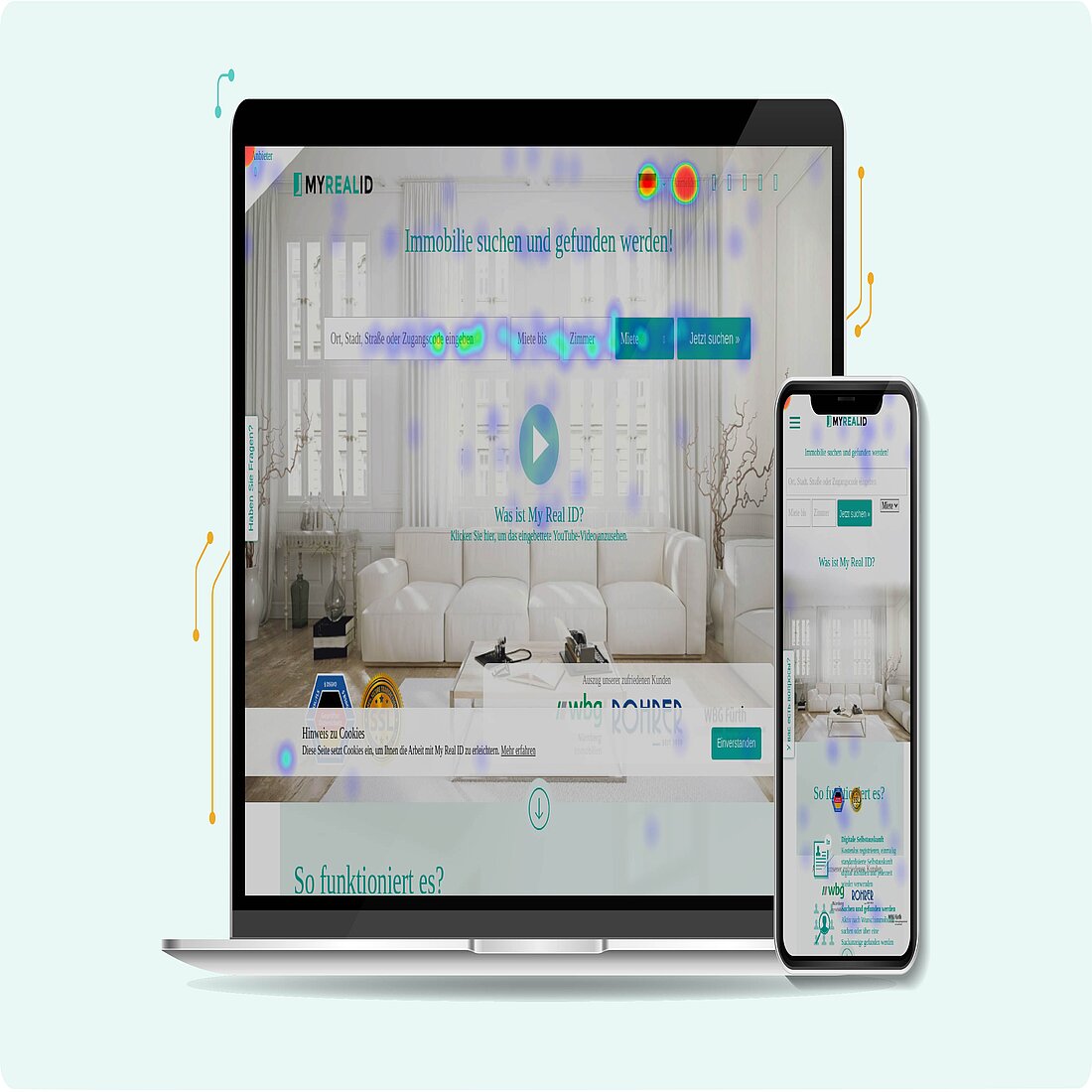
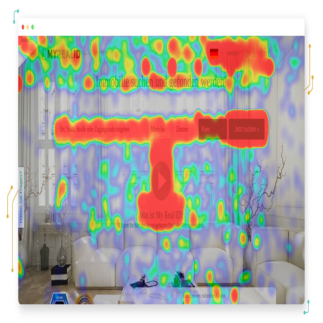
TWIPLA Heatmaps
We introduced our popular heatmaps feature back in 2019. In keeping with the industry standard, our heatmaps are a graphic representation of internet user website activity - they collect detailed information on visitor behavior, and display it over the webpage under investigation.
This website traffic data is displayed en masse, through a warm-to-cool color spectrum to represent frequency (no grayscale heatmaps here!). Warm colors - reds, oranges, and yellows - represent areas of high page activity, while cold colors - blues and greens - represent areas of low activity. No color means that no significant activity was recorded.
What are the Types of TWIPLA Heatmaps?
Our users can generate four types of heatmaps:
1. Click Maps - See Where Website Visitors Click

2. Tap Maps - See Where Website Visitors Tap

3. Scroll Maps - See How Far Website Visitors Scroll

4. Mouse Movement/Hover Map - See Where Website Visitors Move Their Cursor

Desktop vs Smart Device
The four heatmap types outlined above will be generated simultaneously, with the data from computers and smartphones (and tablets) displayed separately.
So for instance, when the information is from website visitors that use a desktop, it is displayed in a click heatmap. And, when it is from visitors that use a touchscreen device, it is displayed in a tap map.

What Can You Learn From TWIPLA Heatmaps?
Our heatmaps are an advanced website analytics feature that helps marketers to improve the performance of their website. They collect data on clicks and taps, mouse position, and average scroll rate, enabling you to identify the best-performing buttons, links, and hotspots, as well as bugs and broken links.
This provides you with a rich understanding of user behavior across your website - what they interact with, what they ignore, and how they navigate from webpage to webpage. It pulls out broad insights about your audience, which you can then use to carry out date-driven website improvements.
When carried out effectively, the result is an improved user experience, and increased conversion rates across your website. This can be achieved by something as simple as moving your priority CTA around the page until it attracts the number of clicks you want, or by changing the layout of the content so that you get more eyes on critical information.
And since heatmap data is categorized by user device, you’ll be able to quickly see whether it’s worth dedicating time to making the website mobile friendly, or whether it would be better to dedicate resources somewhere else.
You’ll also learn which countries your website visitors live in, and can then focus work on getting the most clicks out of this audience. This would involve things like prioritizing the top languages in these locations when doing translation work, building publishing timetables around local calendars, meeting cultural expectations, and so forth.
Crucially, your heatmap data can also be viewed in list form. Our heatmaps will automatically create a list of all the web page elements, and the number of clicks and taps on each of them, so you can easily identify the best performing buttons and hotspots. And, if you want a closer look at the data behind your heatmaps, it can be downloaded and exported to whatever data analysis software you prefer for further analysis!
How Much Data is Collected?
Activate a heatmap, and it will collect data on 2,500, 5,000 or 8,000 website visitors (or 50 for our free users), depending on how you’ve set it up. Beyond this, you have complete control over what data your heatmaps collect.
How Many TWIPLA Heatmaps Do You Get?
TWIPLA users are given up to 35 heatmaps to use across their website each month, with the exact number dependent on which payment plan you’ve chosen:
How to Use TWIPLA Heatmaps?
Our heatmaps can be activated at any point in the month, and can be set up in a couple of seconds. You have complete control over the data you collect, and can choose the:
- Number of pages to track - you can choose to study a single page like the homepage, or choose to track a collection that share the same layout or purpose like product pages
- Number of page views to record - you can set a 2,500/5,000/8,000 cap on total views (or 50 if you’re a free user)
Crucially, you can pause, stop or restart the data collection process whenever you want. Once the heatmap has collected data up to the upper limit of page views, you’ll need to reset it to start bringing in data again.
Heatmaps FAQ
What are heatmaps?
For marketers, heatmaps are a color-coded graphic that shows the frequency of visitor activity across a webpage, including their interactions with each element of a page.
Why use heatmaps?
Heatmaps make it really easy to analyze website visitor data, and you can use this information to improve the user experience, increase the conversion rate, and drive revenue.
What does a heatmap show?
Heatmaps show data on website visitor behavior, such as their clicks or taps, how far they scroll down a page, and their cursor position during the session - some even record eye movement!
How does a heatmap work?
Heatmap works by collecting data on internet user activity while they are on a specific webpage or webpages.
Will heatmaps slow down my website?
The TWIPLA script was designed to to minimize any impact on website performance and, while it shouldn’t slow websites down, it can have a negative impact on the load speed of the page under investigation.
How can heatmaps improve my eCommerce business?
Heatmaps exist to help guide your website development, and make it work better. They’re cheap, intuitive, and are a viable option for any company with an online presence.
How do I create a website heatmap?
To generate a heatmap, you can use a heatmap tool or website intelligence platform like TWIPLA. Sign up to us, add the tracking code to your website, and then create a heatmap in the TWIPLA dashboard.
Where can I find a free website heatmap?
To generate a free website heatmap, use a website intelligence platform such as TWIPLA. SIgn up to us, add the java script to your website, and you’ll have a free heatmap available to you every month.
How do I read a heatmap?
You can either read a website heatmap by looking at the graphic visualization for each user action type, or by viewing the raw data itself.
What’s the difference between mouse-tracking and eye-tracking heatmaps?
Mouse-tracking heatmaps record the cursor position throughout a visitor’s session on a webpage, and are powered by data-driven heatmapping software that is based on real user behavior. By contrast, eye-tracking heatmaps use attention mapping software that records eye movement during the first few seconds of the session, and uses AI and predictive modeling to generate a more advanced visualization.
What are dynamic heatmaps?
Standard heatmaps are only useful for analyzing static web pages since any moving elements will confuse the results. By contrast, dynamic heatmaps enable you to study real-time visitor behavior on pages with dynamic content.
Can I use a heatmap on my Shopify store?
Yes, there are tools that enable you to create heatmaps for your Shopify store, including our own TWIPLA platform.
Can I use a heatmap on WordPress?
Yes, there are heatmaps that have been designed to work on WordPress websites, including TWIPLA.
Do heatmaps help you learn more about user intent?
Heatmaps exist to teach you about user intent. They enable you to determine which webpage elements get the most attention, which content your audience engages with the most, and which elements they ignore,
What decisions can be taken based on website heatmaps or session recordings?
Website heatmaps are there to teach you about your website visitors as a whole, while session recordings enable you to follow individual users around the website. When used together, these tools complement each other to create in-depth insights that can be used for effective website optimization.
How should I use heatmaps with other analytics tools?
One of the best things about heatmaps is how easy they are to integrate with other analytics tools. You should use heatmaps to lead any website optimization assessment, identify issues, and then use other analytics tools to better understand user intent, before devising an improvements plan accordingly.
How do you drive conversions with heatmaps?
Heatmaps provide a lot of information about website visitor activity, and can help you identify friction points, the effectiveness of calls to action, and which page areas that internet users interact with the most. This information can all be used to improve the conversion rate.
How do you get the most out of using website heatmaps in conversion rate optimization and web analytics?
Start by deciding exactly what you want to learn from the heatmap before generating one with the inbuilt session recordings feature activated so that you can pull broader insights from it. Compare this data with other analytics tools and get visitor feedback. Make your webpage improvements and then generate another heatmap once enough time has fasted to assess the effectiveness of your work.
Can I use heatmaps and comply with GDPR and privacy regulations?
Yes you can! Our TWIPLA website intelligence platform includes heatmaps, and has been designed to meet the requirements of GDPR and all other data privacy regulations around the world.
How do you use heatmaps to take your SEO strategy to the next level?
Heatmaps can be used to supercharge your SEO strategy. They provide you with a better grasp of user intent, the quality of your content, and whether internal links are resonating with visitors. You can also use them to change the website layout to improve the user experience, optimize keywords to improve your click-through rate, and make data-driven adjustments to titles and meta descriptions.
Which is more important for SEO, a heatmap or a scroll map?
Scroll maps are a type of heatmap, which are all indispensable tools for marketers looking to improve their SEO.
You Made it to the End!
Now that you’ve read this hub, you should know a little more about what heatmaps are, how they work, and how to pull useful information out of them for your marketing work.
They really are a website marketer’s best friend, and using the right one when looking for information will ensure that you can effectively and efficiently tweak the design and content, based on real-time data rather than hunches or assumptions.
If you enjoyed this hub and think that other marketers would learn something useful from it, then feel free to share it around!
Share article
Stay Updated & Get Inbox Insights
Keep pace with the world of privacy-first analytics with a monthly round-up of news, advices and updates!