
- Frequently Asked Questions

- All About Features
- How to Install the Tracking Code
- User Guides
- Integrating With Other Platforms
- Legal, Data Privacy & Certificates
- White Label Analytics
- Glossary
- Affiliate Program
- Contact
Visitors Feature
5 Sections That Tell You Almost Everything You Need to Know
What It's All About

Within the Visitors feature of the statistics module, you have five sections that deliver almost all data you need about your website's visitors:
Traffic is the soul of your website. If there are visitors, there will be clients.
Set the Time

Right above the tiles, you can see a date picker. This enables you to select a certain time period, or specific day, for which you want the Dashboard's data to correspond.
It is crucial to limit the presentation of data to specific dates or timeframes during which you executed potential campaigns or implemented other strategies. This will allow you to assess the effectiveness of these actions and use the insights gained for future planning.
Some General Hints
- A lot of elements contain options to hover information or further actions. Just let your cursor run over various elements and discover how much data is packed into a tile.
- In the upper right corner of this view, you'll find the "Refresh" button. This will refresh the entire page on click.
- On the left side of the Refresh button, you can find the “Screenshot” icon. This allows you to filter the visits for which recordings could be created.
- You can customize the number of entries shown per page and easily navigate the data using pagination.
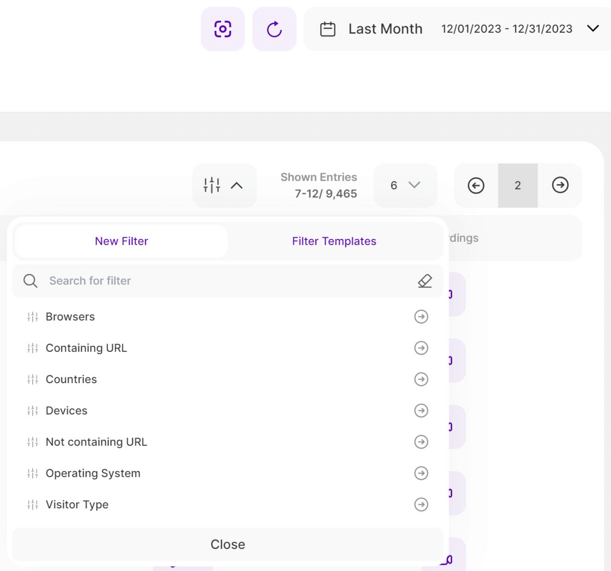
- To empower you with greater control and deeper insights, you can now use an array of new filters on our Latest Visitors Report Block. You can either create a new filter using one or a combination of the following filters. You can also save the filter template and use it at a later time:
- Browsers
- Containing URL
- Countries
- Devices
- Not containing URL
- Operating System
- Visitor Type
Latest Visitors

This view provides you with a list of all your latest visitors to your website within the selected date range. Each row of the table presents a visit and displays further information about a visitor. The table is consists of the following columns:
- Visitor Type & Date: This column displays the visitor type along with the complete date and time of visit. Below are the visitor types available:
- Returning visitor: Someone who has visited your website before.
- New visitor: Someone that has NOT visited your website before.
- Converting Visitor: Someone who has visited a page of your website during his visit, that you have defined as a "conversion page“ in your settings.
- Country Info: In this column, you will see the flag and the country the visitor is coming from. If you hover your cursor over the flag, you’ll see Visitor’s approximate location. Clicking the location icon will forward you to the map view in which you will see even more information about the approximate geo-location of that visitor.
- Visitor IP & Company: The IP address is a unique string of numbers separated by full stops that identify each computer using the Internet Protocol to communicate over a network. If you are subscribed to the minimum pricing plan, you'll have access to the Company Reveal feature wherein it analyzes the IP addresses and cross-references them with company-owned IP ranges. The feature will display the respective company's name if the visitor's IP address matches a known company-owned IP range. On the other hand, if the IP address does not correspond to a company-owned range, it will only display the visitor's Internet Service Provider (ISP) instead.
- Device/OS/Browser: Here you are being displayed what device (mobile, tablet, desktop), operating system (OS, i.e. Windows, Android, iOS, etc.) and browser (i.e. Chrome, Safari, Internet Explorer, Firefox, etc.) were used by this visitor. Move your mouse to the different icons to see more information.
- Visited Pages: If you want to know which pages of your website this visitor has visited during his session, check this column. The column displays the Visitor's Visited Pages, sorted by the newest first. It shows the page title, page URL, and the date and time of the session. Clicking the link will bring you to the visited page.
- Recordings: Indicates the availability of the recording. Click the icon to view the session recording and access additional information.
Important Hints:
- Don't forget that you have the option to set the time range on the date picker to retrieve the desired data.
- You can customize the number of entries shown per page and easily navigate the data using pagination.
Map

This world map shows you where the traffic on your website is actually originating from. It enables you to see right from the start whether there is a strong tendency of visitors coming from a certain continent, country, region or even city.
Geo-location plays an important role in improving the performance of your website, as it allows you to check whether you should optimize your campaigns or content for certain cultural needs, languages, time-zones, etc. – depending whether you want to get even more traffic from this region or start to receive visitors at all.
The visitors are clustered within the green bubbles. The number within a green bubble tells you how many visitors came from this region. Single black "location" icons, represent only 1 visitor. If you hover your cursor to one of these icons, it will display more information which includes: the flag of the country the visitor is visiting from, the device, operating system and the browser used by this visitor. You can also zoom into the different regions of the world (i.e. by clicking on one of the green bubbles or using the "+" and "-" in the upper right corner of the map) – through many levels – and retrieve more precise data about the visitors data.
The location accuracy is based on the IP-address registration. Each IP is registered and provided by the service that assigned it. While complying with the privacy laws and policies, the location is displayed somewhere in an X mile radius every time (e.g. city, or even neighborhood).
Traffic Charts
If you want to check additional data in regards to the timewise distribution of your website’s traffic, this is the correct view to open.
Important Hints:
- All charts display the amount of visitors on the vertical y-axis. The scale is always calculated automatically for you.
- The bars within the charts have 3 different colours:
- Green: Stands for "High traffic" compared to your average traffic overall. It marks the hours, days, weeks with a high traffic amount on your website.
- Yellow: Stands for "Medium traffic" compared to your average traffic overall. It marks the hours, days, weeks with a medium traffic amount on your website.
- Red: Stands for "Low traffic" compared to your average traffic overall. It marks the hours, days, weeks with a low traffic amount on your website.
- The displayed charts depend on your selected time range in the top bar.
Selection "Last 7 Days" – Shown Charts

In the "Last 7 days" time range, this tab displays four graphs. The first two graphs are as follows:
- Number of Visitors by Hour: This shows you, based on the selected time range in the bar at the top of this view, how your traffic is distributed on an hourly scale. It helps you to see whether your visitors on average browse your page in the morning, in the afternoon, during the night or at any other time of the day.
- Number of Visitors by Week Days: Here you see, based on the selected time range in the bar at the top of this view, how your traffic is distributed on an week day scale. Do your visitors browse your page on average on Mondays, Fridays, in the middle of the week or on weekends? This chart will provide you with the answer.
The next two graphs show the number of page loads which are described below:
- Number of Page Loads by Hour: This graph presents the distribution of page loads on an hourly scale, based on the selected time range. It allows you to understand at what times of the day your website experiences the highest and lowest page loads. This supports the data of the graph "Number of Visitors by hour".
Number of Page Loads by Week Days: This graph illustrates the distribution of page loads across the days of the week, using the selected time range. It provides insights into which days experience more page loads and helps you identify any patterns or trends in page load activity throughout the week. This supports the data of the graph "Number of Visitors by week days".
Selection "Last 12 Months" – Shown Charts

- Number of Visitors by Month: Just as you have the average traffic distribution by hour and weekday, this chart gives you an overview of the average distribution throughout the past 12 months. Noticing seasonal traffic increases/decreases on your website will further help you to understand your user base and how you can target them better.
- Number of Page Loads by Month: This shows you, based on the selected time range in the bar at the top of this view, how your page load traffic is distributed on an monthly scale. This supports the data of the graph "Number of Visitors by Month".
Selection "Last Year(s)" – Shown Charts

- Number of Visitors by Month: Just as you have the average traffic distribution by hour and weekday, this chart gives you an overview of the average distribution throughout the specific year you selected in the time selector. Noticing seasonal traffic increases/decreases on your website will further help you to understand your user base and how you can target them better – especially if you compare the data of the different years with one another.
- Number of Page Loads by Month: This shows you, based on the selected time range in the bar at the top of this view, how your page load traffic is distributed on an yearly scale. This supports the data of the graph "Number of Visitors by Month".
Important Hints:
- The data from the charts above can support you with many different topics, i.e. in planning your campaigns or timing updates/downtime of your website.
- Check these charts regularly to always be up to date when it comes to planning your marketing/technical measures. This will support you strongly in generating maximum success of your launched campaigns.
Countries/Cities
Number of Visitors by Country

The "Countries/Cities" view basically acts as an extension of the map view. It displays all the countries and cities, sorted by "country/city with most visitors" first, which generate visitors or traffic for your website.
Here's what you can find on the first graph:
- Country: Each bar in the table represents a specific country that has been identified as the source of website visits.
- Percentage: The percentage shown next to each bar indicates the proportion of total website sessions attributed to that particular country. This helps you understand the relative contribution of each country to your overall web traffic.
- Total Number of Visitors: Alongside the percentage, the total number of visitors attributed to each country is displayed.
At the bottom of the graph, you'll find a button labeled "Load more" to display additional pages. Clicking on it will extend the graph downward displaying more pages that show all the countries.
Number of Visitors by City

This is the second graph under "Countries/Cities," displaying the cities where your visitors originated. You'll notice a dropdown selection in the upper right corner, enabling you to refine the displayed cities by country. This feature helps you extract more accurate data on a city basis.
Similar to the previous graph, you'll see the following information:
- City: Each bar in the table represents a specific city identified as the source of website visits.
- Percentage: The percentage shown next to each bar indicates the proportion of total website sessions attributed to that particular city. This helps you understand the relative contribution of each city to your overall web traffic.
- Total Number of Visitors: Alongside the percentage, the total number of visitors attributed to each city is displayed.
At the bottom of the graph, you'll find a button labeled "Load more" to display additional pages.
Visitor Company Distribution

On the Visitors tile, in addition to displaying the IP addresses, company names, or network providers of the visitors who viewed your website, there is a new tab called "Visitor Company Distribution". As part of the Company Reveal featiure, this tab provides valuable statistics and insights into the companies or carrier networks that contribute the most to the overall traffic on your website. The tab presents this information in the form of a table with bars representing each company or carrier network.
Here's what you can find in this view:
- Company or Carrier Network: Each bar in the table represents a specific company or carrier network that has been identified as the source of website visits.
- Percentage: The percentage shown next to each bar indicates the proportion of total website sessions attributed to that particular company or carrier network. This helps you understand the relative contribution of each entity to your overall web traffic.
- Total Number of Sessions: Alongside the percentage, the total number of sessions attributed to each company or carrier network is displayed. This provides a concrete figure indicating how many visits your website received from each entity.
By default, the table shows the top 6 companies or carrier networks. These are likely the most significant contributors to your website's traffic. Understanding this distribution can be helpful in assessing the effectiveness of your marketing efforts, identifying potential business partners or customers, and gaining insights into the geographical reach of your website's audience.
With this information at your disposal, you can make informed decisions about your website's content, marketing strategies, and partnerships to further optimize and enhance its performance.
Important Hints:
- To view the name of the companies or the carrier networks, a minimum pricing plan must be purchased.
- Make sure the desired time period is selected, so that the data matches what you want to see. You can use the date-selector icon on the top right to change it.
- At the very bottom of the graph you'll find a button with the label "Show more". Clicking on it will extend the graph downward displaying more pages that show the companies or carrier networks.
- Clicking or hovering on the ISP or Company Name will show a tooltip saying "X Visits overall from this company IP in the selected period of time".
- If you are not subscribed to the required minimum pricing plan, it will only show "Reveal Company Name", once tapped, a tooltip will show the information about the required plan, your current plan, and the Upgrade Plan button.